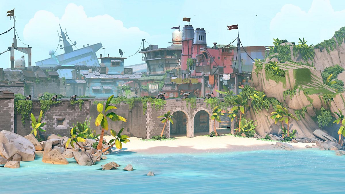
Valorant’s latest map, Breeze, is very different from anything the game has seen before. A much larger overall design with long sightlines makes it a unique experience to play, while its vibrant tropical setting is a sharp contrast to the cold, angular style of the last map introduced to the game, Icebox.
Today, Riot Games has lifted the curtain on the development of Breeze, from the conception of its basic design to the particulars of its various details and style via a new dev diary video. You’ll hear from game designer Sal Garozzo, level designer Joe Lansford, art director Devon Fay, and 3D environment artist Brandon Martynowicz as they talk us through the challenge of making Breeze.
Some interesting takeaways include the revelation that Breeze was actually the first map Riot developed post-launch, even though Icebox came almost six months after the game released. That means it’s the first map that has benefitted from player feedback, both casual and professional, and a principal reason why it is so much larger than the maps that have come before it.
On the art side, I think it’s also interesting to hear the new design imperative to incorporate story spaces within each map. Riot has already suggested that we’ll be hearing more about Valorant’s lore, and so the idea spaces around Breeze will be used to tell stories moving forward is certainly exciting.



Updated: Jun 14, 2021 01:10 pm