With Monster Hunter XX scheduled to release on the Nintendo Switch and 3DS in Japan this fall, fans of the series have had quite the incentive to consider purchasing Nintendo’s new hybrid console. The game has a cult-like following that reaches all across the globe so it wasn’t particularly surprising that the game would inspire the very first special edition design for the Nintendo Switch. What is surprising, however, is that this first design would be so lackluster and underwhelming.
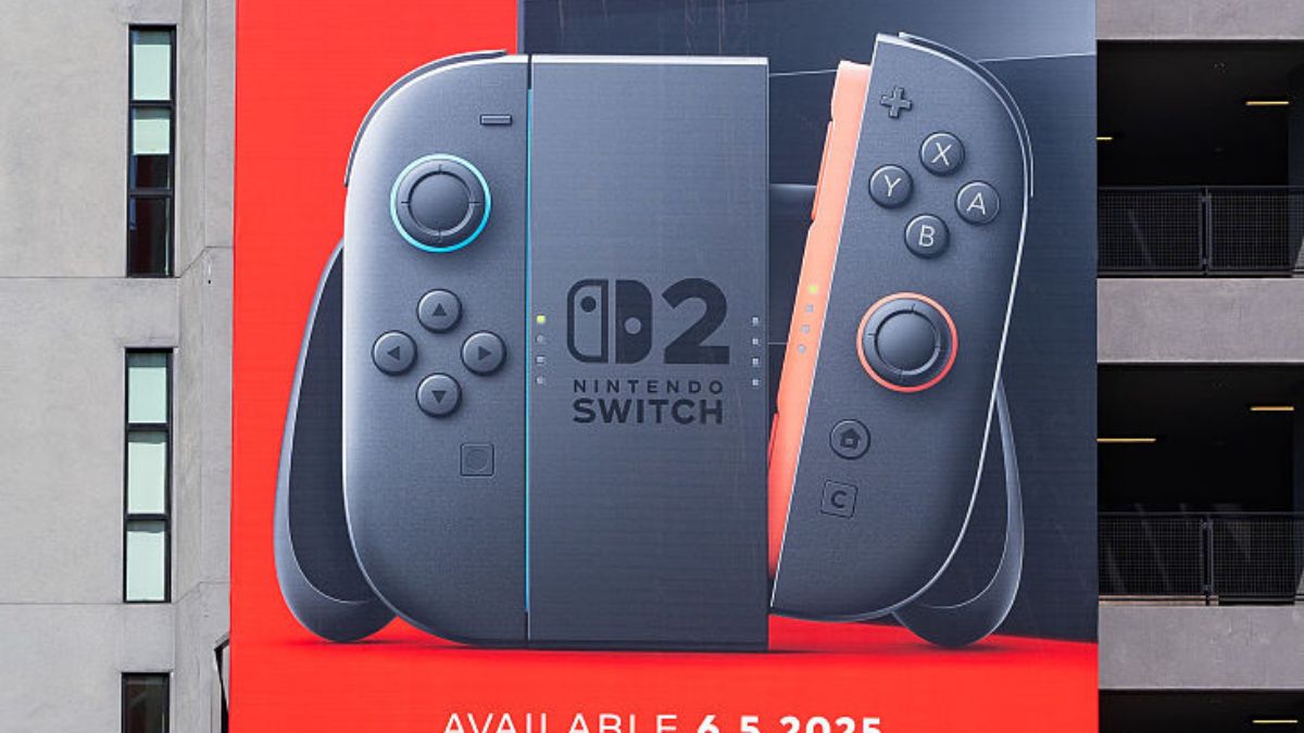
If there is one thing that even skeptics of the Switch have to admit, it’s that the hybrid gaming console has an incredible amount of potential when it comes to possibilities for customization. Whether it’s different color JoyCons, designs on the back of the Switch itself or even creative ways to customize the Switch Dock, Nintendo could really have some fun when it comes to making a variety of Switch units that look fun and unique. For now, however, Nintendo is off to a troubling start as they just squandered the opportunity to make their first special edition design one to remember.

The special edition Monster Hunter XX design is literally a standard Nintendo Switch design that simply throws a few symbols from the game on the dock. The design is so bland that it may have finally dethroned the Call of Duty PlayStation 4 as the most lackluster special edition console design in recent memory. To be fair, it has a slight advantage since the design just comes across as boring and doesn’t seem quite as visually offensive as the Call of Duty PS4.
Monster Hunter XX is scheduled to release in Japan this August where gamers can purchase the game by itself or opt for the bundle, which includes this not-so-special-feeling special edition Nintendo Switch. The choice is yours.
Check Out More
- The Sims 4 Parenthood: How to Raise and Lower Emotional Control Easily
- Portal Knights: How to Beat the Worm Boss
- New ARMS Trailer Invites You to Meet and Greet Twintelle






Updated: May 30, 2017 12:58 pm