Fans from the era of Nintendo’s first home console, the Nintendo Entertainment System, might be surprised to learn that the box art for two of its most well-known games had very different designs early on before they were officially released.
A flyer from an old CES (Consumer Electronics Show) trade show revealed that both The Legend of Zelda and Punch-Out!! for the NES had early versions of box art that resembled the black box designs used for the console’s sports series of games, such as Volleyball and Pro Wrestling.
This flyer was shared on Twitter over the weekend by Martin Lindell, who snapped a photo of it from his friend Alex’s personal collection. It is one of many papers that Alex bought from a former employee of Bergsala, the Swedish Nintendo distributor, who got it from CES in 1986 or 1987.
As you can see in the photo of the flyer, which was handed out to trade visitors at CES, the Legend of Zelda was advertised in the middle of a group of sports games; “Introducing four good sports and a princess named Zelda,” the headline reads. The description below encourages retailers to keep their eyes on Nintendo.
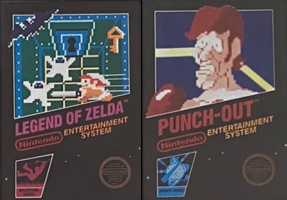
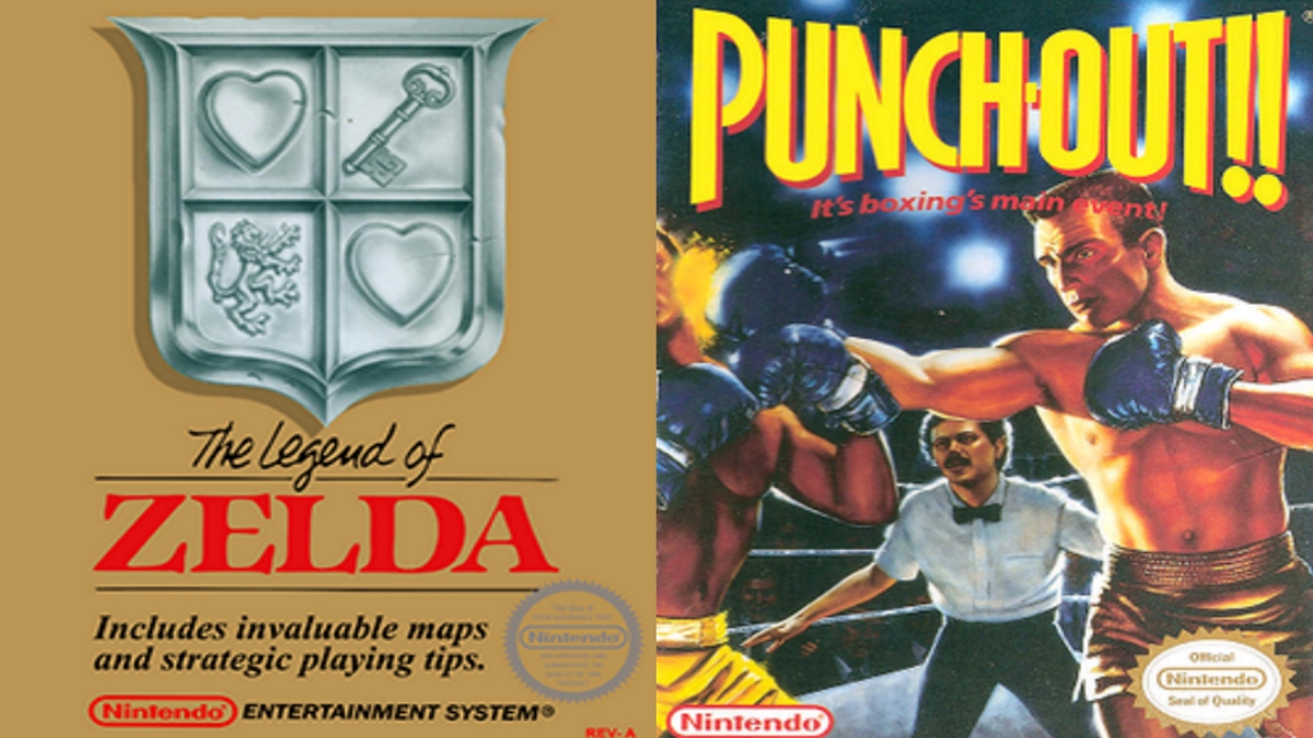
You can see that these black box designs feature actual sprite artwork from the games. They are quite different than what the games’ boxes ultimately ended up looking like—The Legend of Zelda ended up with a simplistic gold cover with the game logo and description on it, while Punch-Out!! got more realistic artwork on its cover.
Whether these early versions were just meant to be placeholder artwork until the final look was approved or if Nintendo had a change of heart before the games were released, it’s interesting to see these box art designs uncovered after several decades.



Updated: Oct 10, 2022 01:03 am