Today Square Enix hosted a livestreamed panel focusing on the art created for its popular MMORPG Final Fantasy XIV.
The panel was supposed to happen at PAX East, but Square Enix opted to do it from its headquarters in Japan due to the Coronavirus outbreak.
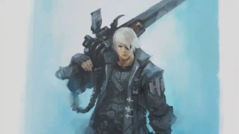
The artwork was presented by producer and director Naoki Yoshida and lead concept artist Yosuke Mogi. You can see it all at the bottom of the post.
We learned that the art for the Blue Mage’s outfit was inspired by the movie “The Greatest Showman.”
When designing the Dancer’s outfit, Mogi-san really wanted to design a male character like a Hrothgar, but there was no other outfit that would fit the Viera as well, so in the end, he had to design a Viera.
The outfit itself was inspired by Maya from Dragon Quest IV.
Interestingly, we also hear that we may see more variation in the design of the chakram in the future. Originally, the idea was to have dancers wield fans. While that would become a bit too similar to Dragon Quest, the team still liked the idea of them to be able to throw a lot of different things.
Most of the weapons we have so far were designed very early in the Shadowbringers’ development process. That’s why they’re all chakrams. In the future we might see different items, and things like giant shuriken could be a possibility.
The Gunbreaker’s outfit had to look a bit more modern in design. It was challenging to make it fit into the world. The pillar from the ruins of Ronka was added to balance the modern with the past.
The original design had a gunblade resembling a light machine gun. Mogi-san was playing a lot of Overwatch at that time. That design was rejected.
Thancred was used as a base because it was already known at that time that he would become a Gunbreaker.
Moving on to Emet-Selch, Yoshida-san mentioned that he was voted as sixth most-popular Final Fantasy character by Japanese fans in the NHK survey, and thanked everyone who voted for him and for other FFXIV characters.
Mogi-san loves to design characters with visual quirks. He also felt that the game lacked characters with a strongly defined nose. He also wanted to portray some of Emet-Selch’s personality quirks in his design.
Speaking of Alphinaud and Alisaie, Mogi-san wanted to show a bit of their adolescence left, as they are growing characters.
On the other hand, with Y’shtola, it was challenging to design a black dress on a dark background, but Migi-san had a lot of fun with her majestic skirt.
Urianger also has black clothes and his garb is simpler than Y’shtola, so that was also challenging. Mogi-san augmented the design with the celestial jewels and the light from the cards.
Urianger has earned a lot of fans due to the design showing his muscular shoulders created to balance the outfit.
Incidentally, Yoshida-san revealed that the scions had to change jobs to fit the Trust system. That needed to be balanced. For instance, there was no tank among them before. Since Thancered would become Minfilia’s protector, he was made into a tank.
A lot of the scions didn’t really have jobs identical to the players’ as their jobs were originally hybrids.
Speaking of Ardbert, he has a lot of fur in his armor. Mogi-san didn’t want him to look like Santa Claus, so he added a lot of brushwork to make sure that it looked like animal fur.
He also had to be given a wide stance to balance his large axe.
The Crystal Exarch was originally designed by Agamine-san who usually works on monster design. Mogi-san used heavier lines for the robe to follow Agamine-san’s style.
Moving on to Thancred two designs were shown. The one on the right was the final version as the original design on the left had the blade of the gunblade designed on the wrong side. That was pretty embarrassing, but it’s very rare for Mogi-san to make mistakes like this as he is very careful about details.
The new outfits for the various jobs were designed within thin panels because otherwise, it would have taken forever. It was indeed faster, but it ended up being a pain to fit both faces and weapons in that tiny space, so it ended up requiring more work from Mogi-san.
Making it work with characters of different sizes also added additional challenge.
The artwork created for update 4.4 was designed when the team already knew where the story was going to go, about two weeks after the release of 4.3. Alphinaud was included because he was about to go on his own journey to the Garlean Empire. He may seem like he doesn’t belong among the other characters, but he actually does.
You can also pretty much draw a line down the middle between the two sides the characters stand for. In the earlier versions of the art, Alphinaud looked very sad, and Mogi-san was asked to redo it a few times.
The artwork for update 4.5 was to represent the finale of the 4.x story. It included all the flags of the allied forces. It’s very colorful as opposed to the previous one, which was very dark.
If you put them together, they convey the theme of the finale with the Garlean Empire on one side and the Eorzean alliance on the other, led by the Warrior of Light.
Initially the plan was to have the two sides facing each other, but in the end, Mogi-san thought that if everyone in the 4.4 art lookedin the same direction, the artwork on its own would look odd.
Mogi-san decided that the art created for 2019’s edition of The Rising event should look like a peaceful and nice postcard from Hawaii, even if he has never been there.
Before A Realm Reborn Yoshida-san was very hands-on with seasonal event artwork. After 2.0 he has become a lot busier, so he doesn’t really see this kind of art until the very end. He was surprised to see the Wandering Minstrel so big in the picture.
Mogi-san wanted to show his face, so he came up with the idea of having him hold the goggles in his hand.
Since the Wandering Minstrel pretty much represents Yoshida-san himself, it was very difficult for him to comment on it.
Moving on to gear design, we get to see armor designed for update 5.2. Creating this kind of design is pretty much Mogi-san’s main job. He has to be careful about designing the models as clearly as possible. He also has to keep in mind the whole process, including the 3D model.
Since all gear sets have five pieces, everything is designed with that kind of subdivision. Of course, different races need to have their own variations, for instance in the ears for helmets.
The easy way out would simply be to not have the ears displayed, but the team tries to have them when possible.
Yoshida-san mentioned that with time he’d like to figure ways to introduce helmets specific to Viera and Hrothgar, and the same can be said for hairstyles. In the meanwhile, he’d like players to be patient about this.
It’s easier for Mogi-san to produce multiple drafts than for the modelers to do a lot of trial-and-error, so he tries to take on most of that work before the artwork reaches the 3D team.
Speaking of the legs part, many designs aren’t seen in-game because they’re usually covered by other pieces of equipment. Yet, Mogi-san has to draw them all. Creating that kind of detail is still required for the model to be completed.
Yoshida-san mentions that there aren’t many people who take on more work so that others have less to do, but Mogi-san is one of them.
The next step is redesigning the equipment for the other roles. Changing the colors and swapping out certain parts is a common way to achieve that. While the silhouette may be similar, many elements are different.
We also see a weapon that Mogi-san really likes, but players didn’t really use it much due to the item level. When he created it, he was still working with another development team.
Mogi-san writes a lot of information on how weapons are supposed to work, even if it’s not always realistic.
Moving on to the design of the Hrothgar. They needed to be a beastly race but different from miqo’te, viera, and roegadyn. This uniqueness was the main challenge when designing them.
The markings in the designs had no feature in the game that allowed their display, so it had to be implemented from scratch. The team had to figure out tradeoffs in order to manage to make things work, like the lack of helmets.
We also get to see some designs that were rejected. One looked too much like a mask, while the other was too similar to miqo’te. The eyes were too big.
For the draft for Titan in the Eden raid, Mogi-san decided to stay faithful to the original design, but make him massive. He also had to design a lot of variations for his various forms. Most of them were just random ideas.
After that long brainstorming process a few final forms were selected. At that point, the final art was finally created.
Ranjit was considered a monster and not simply an NPC in terms of budget and workload, and he was designed by the monster team. He was nicknamed “Assassin Granpa” by the team since his name wasn’t decided until much later. Even when he got his name, it didn’t feel natural to call him anything else than Assassin Granpa.
The inspiration for his second form came from Romancing SaGa.
Interestingly, Yoshida-san mentioned that Mogi-san is working on something that is coming out in the very far future. He’s being asked to create things that he hasn’t done before.
If you’d like to learn more about Final Fantasy XIV, you can read our recent interview with Naoki Yoshida and Banri Oda, our review of Shadowbringers.
Incidentally, we have info on the upcoming Little Ladies’ Day seasonal event.
A few weeks ago we also learned that the game has passed 18 million registered users.
You can then enjoy the report on our latest visit to the Eorzea Cafe in Tokyo, one about the latest orchestra concert, and our look at the recent uniqlo collaboration.
Final Fantasy XIV is currently available for PS4 and PC. Last month, Xbox boss Phil Spencer pledged to help bring the game to Xbox One as well.





Updated: Feb 29, 2020 10:48 pm