Limbo
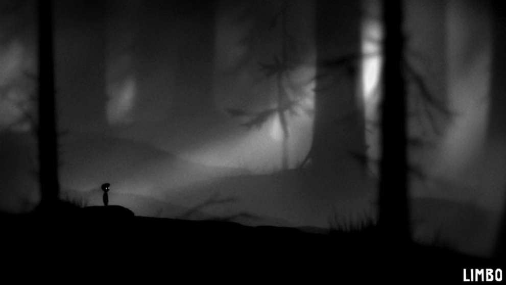
A classic, Limbo is one of the crowning examples of minimalist video games. It shows that you don’t need fancy colors and bright scenery to make a game stand out and really be memorable.
The game is characterized by its black and white aesthetic that sets an eerie and ominous tone throughout every single level.
It constantly reminds you that you’re not somewhere normal nor are you on just any old journey through a forest. You’re trying to find your sister somewhere in the dark and murky corners of this mysterious and troublesome place.
There’s something unsettling following you everywhere you go and you’re constantly reminded that you’re in this in-between place or, in other words, Limbo.
Limbo’s minimalist art style really contributes to its overall theme, gameplay experience, and immersion and it is a perfect example of a video game’s atmosphere done right.
There’s a reason it’s on many a list and it’s simply because it’s a masterpiece in more ways than one.
Path to Mnemosyne

Another black and white game, Path to Mnemosyne is the story of a girl delving deeper and deeper into her mind to find peace with her tragic and traumatic memories.
Based heavily in perspective and viewpoints, you’ll feel like you’re walking through an entire optical illusion as you guide your character further down the titular trail.
From skeletal arms reaching towards the screen to a path guiding you right into a baby’s brain, Path to Mnemosyne sets its own tone with static, muted imagery instead of dynamic backgrounds and bright colors.
The only thing moving is your character and the only colors you see are black, white, grey, and the occasional pop of blue or green.
Path to Mnemosyne takes a particular and detailed spin on minimalist art that just works way too well and many other games should look to it for ways to twist minimalism into something incredible.
Cypher

Continuing with our black and white theme, Cypher is a puzzle game all about cryptography. There are very little details in the game’s scenery and gameplay, instead using stark whites and vivid blacks to guide the player through a muted museum.
Absolutely no color can be found within this game and even the puzzles themselves are restricted to black and white.
To top it off, a persistent classical soundtrack plays as you do your best to solve each and every puzzle, contributing to the peaceful, minimalist atmosphere the game tries to give you.
Cypher’s minimalism allows players to focus entirely on its puzzles with very little distractions. Though, in all honesty, the fact that there is practically nothing in the museum can be pretty distracting.
Regardless, Cypher is the only game on this list that takes the more traditional approach to minimalism with quite a lot of empty space, open areas, and plain locations.
Mirror’s Edge
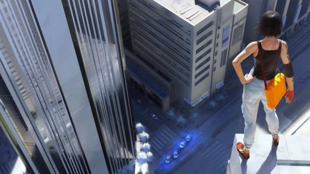
A vertigo-inducing game, Mirror’s Edge takes place high up on tall skyscrapers, dangerous construction, and the occasional sewer dive.
Since there are dozens of ways to parkour to your objective and an entire city is at your disposal, the game helps you out by marking paths you can take by highlighting objects in a stark and bright red.
As opposed to a few of the other games in this list, Mirror’s Edge uses color in a minimally unique way. Much of the city, rooftops, and hallways you run through have a tendency to be white with a specific pop of color, the most often seen being red.
It’s like there’s a selective color filter all over the game that loves to indulge in deep and vibrant reds.
The game’s more or less reboot, Mirror’s Edge Catalyst, continues the theme of red but drops much of the minimalism for an even more detailed city. Regardless, nothing beats the appeal of the O.G. Mirror’s Edge.
Mirror’s Edge shows that minimalist games don’t need to be 2D nor black and white to be artistically minimal. Sometimes all you need is a jump across buildings and a bright red ladder guiding your way.
Superhot
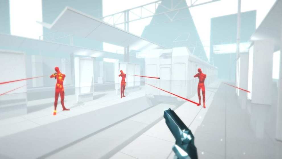
Similar to Mirror’s Edge, Superhot likes the color red. The game sacrifices fancy backgrounds and elaborate maps for its minimalist art, drawing players in with faceless enemies and featureless locations.
It shows that you don’t need much to have a fun and exciting game especially when you can break out Matrix moves whenever you want.
The enemies have little detail, the maps lack features akin to Cypher’s museum, and all you have are weapons laid out before you to use. In a sense, Superhot is similar to a 3D retro fighting game with a tiny bit of modern minimalist flair.
You can’t exactly count the polygons on the enemy’s faces but you can get pretty close and that’s not a bad thing.
Speaking of the enemies, they’re the only objects with any sort of color, being a bright and angry red against stark white walls. They crumble to red diamonds with each hit they take and even their bullets have a vibrant red trail following behind each shot.
Selective color is a fun and visually appealing form of minimalist art and Superhot does a great job of using it to create an interesting gameplay experience.
Thomas Was Alone
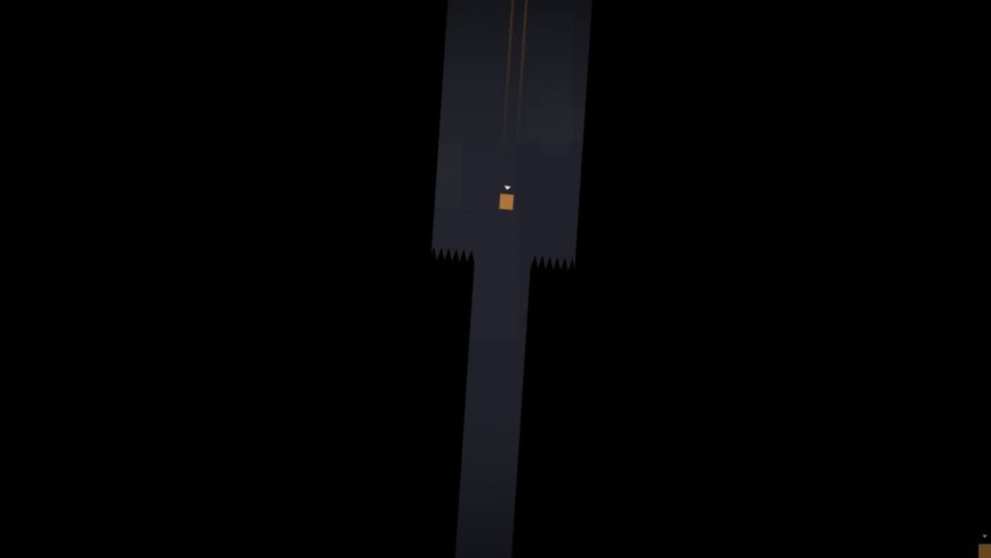
A deceptive little game, Thomas Was Alone uses simple shapes, lines, and colors to present a minimalist environment. It’s one of the more abstract games on this list, akin to a piece of modern art more than a video game.
Don’t be fooled by its odd and unique style of art because Thomas Was Alone has a deep and thought-provoking story that will certainly make you sit and think for quite some time once you finish the game.
It pairs narrative, gameplay, minimalist art, and sound to create a unique game experience that hasn’t really been done by other games.
In a way, Thomas Was Alone is the exact opposite of Limbo or even its abstract counterpart. Thomas Was Alone is on one end of the minimalist spectrum while Limbo is on another.
Regardless, Thomas Was Alone is a beautifully minimal game that uses its special art style to really give players something to talk about.
The Unfinished Swan
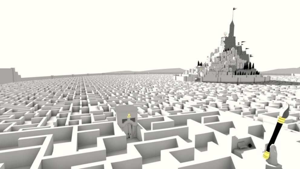
The Unfinished Swan combines black and white, selective color, and minimalist scenery to create its special brand of art.
Similar to some of the other black and white games on this list, The Unfinished Swan has the occasional pop of color set against a white backdrop.
It’s a surreal experience that uses minimalist art to capture a player’s attention and the game is honestly closer to a work of art than a puzzle game.
If we were to place this game on the spectrum Thomas Was Alone and Limbo are on, it would be right in the middle, using both artistry and monochrome to get its story and gameplay across.
The fact that The Unfinished Swan is told like a fairy tale story just adds to the surreal and minimalist way everything is portrayed and shown.
And, this game was made by the same developers of What Remains of Edith Finch so you already know it’s incredibly artistic.
West of Loathing
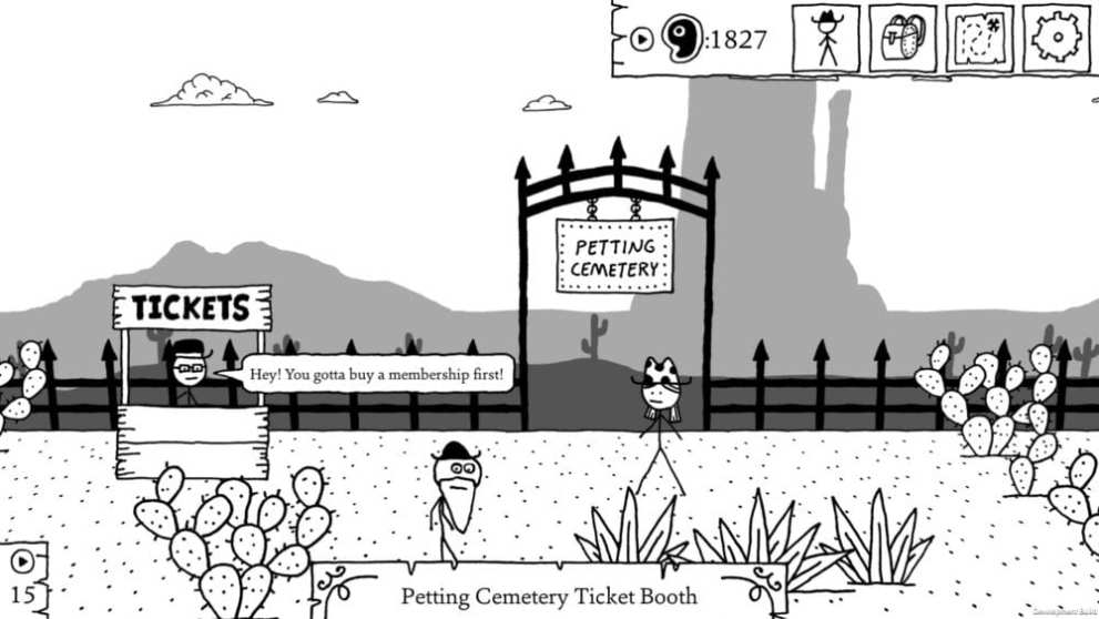
West of Loathing is a funny and crazy take on cowboy games. Its slapstick comedy is one of the many things that make it a game everyone should experience at least once in their lives.
Out of all the other games on this list, it is the least serious but that doesn’t mean it shouldn’t be taken as a great work of art.
Visually, it’s presented like scribbles in a notebook with stick figures as characters and scenery that looks that it was drawn with a sharpie.
Its black and white color also contributes to its notebook-esque aesthetic, effectively feeling like you’re paging through someone’s casual doodles.
Despite its crazy look, West of Loathing is an RPG in every way, using a level-up system, classes, party members, and quests throughout the entire game.
Not many games break out notebook chic for their chosen art style but West of Loathing does it incredibly well.
Bad North
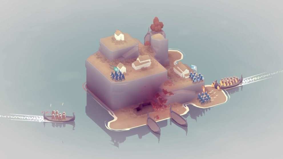
Unlike many other strategy games, Bad North is very minimalist in graphics and appearance. Game series like Civilization or Age of Wonders have very detailed locations and UI’s with characters that match their elaborate art styles.
Bad North, on the other hand, has very little taking up the screen.
A single island sits at the very center of the map and it’s your job to defend it against numerous Viking invaders. The islands themselves have very little detail other than tiny houses, elevated landscapes, and occasional trees.
The tiny warriors you control are more akin to little blobs holding swords and wearing helmets than intricately designed soldiers.
Its minimalist art and nature certainly doesn’t mean it’s lacking in gameplay. It’s a strategy game through and through and you’ll find that defending your little island will be harder than you think.
Monument Valley
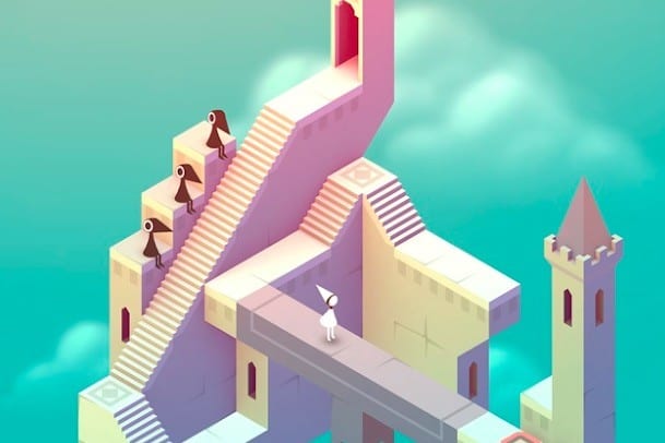
Finishing out the list is a mobile darling, Monument Valley.
Unlike many of the other games on this list, Monument Valley uses color and beautiful maps throughout each and every puzzle. However, much of the game’s minimalism still comes from these soft pastels, vibrant colors, and optically illusive locations.
Not much moves throughout the game. Most of the time it is either your character or the enemies walking back and forth with the occasional path rotation. Even the camera is restricted to one specific viewpoint and perspective.
Instead of high details, many of the characters are smooth in texture and have very little features. For example, the princess you take control of has no face. Regardless, she’s still really cute.
Monument Valley really is a twist on minimalist art. It and all the other games on this list show that there are many ways to portray a minimalist art style and they also show that minimalism doesn’t mean that a game lacks in any other department.
For more on these minimalist gems and their developers, have a look at Monument Valley 2, a tease of the Limbo developer’s next game, the newest project by Thomas Was Alone’s devs, and our review of Superhot VR.






Updated: Aug 8, 2019 11:26 am