Pulling off the perfect heist never felt as good as it does in Payday 3. Once you’re in the game itself, there’s really nothing else that delivers quite the same mix of team-based stealth gameplay. Unfortunately, it’s a shame that getting there is such an unpleasant experience.
Laborious log-in processes, menus hidden with menus, tutorials that do nothing to prepare you for the full game, and unexplained UI elements all contribute to a terribly packaged Payday 3. It’s not alone, though. In many ways, it’s starting to feel as though games, in general, are taking a step back when it comes to letting us get in and have fun.
Please Don’t Make Me Use an On-Screen Keyboard To Play Your Game
Let’s put aside for a second, the myriad server problems that Payday 3 has faced in the days since it went live. While you would hope that after all these years online games would be able to launch with reliable servers, it still doesn’t seem to be the case. Just this year Diablo 4 and Street Fighter 6 had their own launch day hiccups. Let’s assume, however, that Starbreeze will get their own technical troubles ironed out before long and not hold it against them.
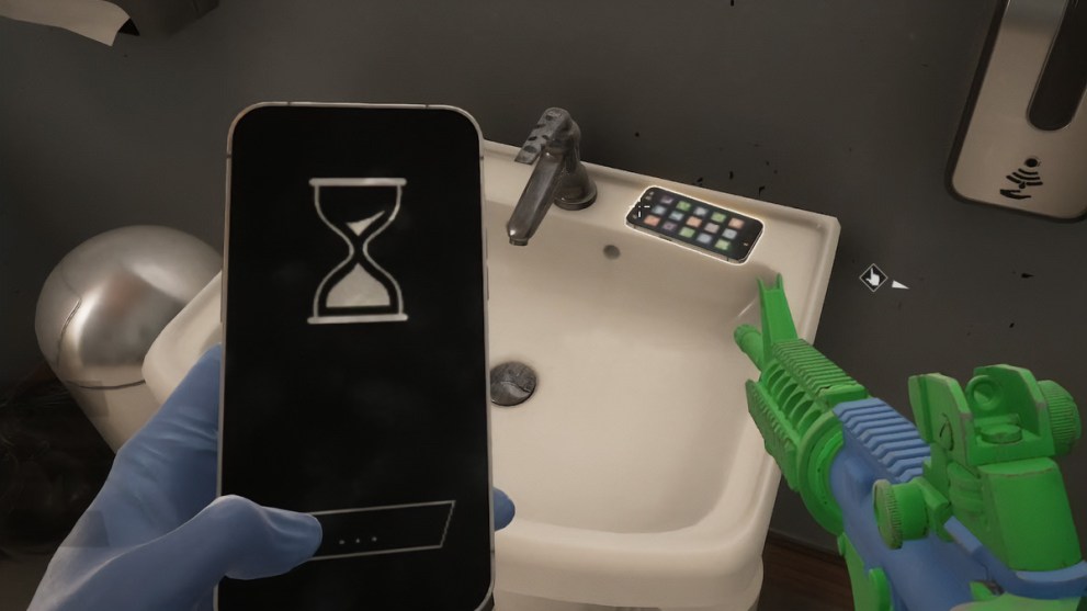
The few hours I did manage to spend in the game yesterday were unfortunately marred by other, less forgivable frustrations. These started as soon as I fired up the game via Game Pass on my Xbox Series X. And was instantly faced with a log-in screen.
I loathe this.
It just makes no sense to me why I should need to jump through these hoops. Whether it’s a case of Microsoft/Sony/Nintendo working together with publishers to offer a more efficient way of linking whatever proprietary log-in service with your existing Gamertag/PSN/NSO accounts, I don’t know. Still, there must be a solution that better serves the player.
After much swapping back and forth between the Xbox’s Edge browser, the browser on my PC, and checking for validation emails on my phone I finally had an account set up and was ready to play. All told the process must have taken me at least 15 minutes and I’m still not entirely sure if the account is linked to my Xbox Gamertag, or if it is at all linked to an existing Nebula (Starbreeze’s log-in service) account that I may or may not have had from playing Payday 1 and 2 some years back.
Regardless of how intuitive or confusing a per-game sign-in process might be, it’s simply not a good way to welcome new players to your game. It’s a sentiment seemingly shared by Reddit users, with one post by user SuperFakks – an image of Payday 3’s log-in screen titled “One of the top worst ways to start a game” – reaching the second spot on /r/all during the game’s first full day of live service.
The post currently sits at 43k upvotes, clearly showing that gamers have collectively had enough of this inconvenience. Whatever happened to firing up a game and being greeted by an exciting FMV before the title screen? Something that made a game feel like it was an actual piece of art you were about to experience rather than just another service to be bound to.
The comments in the Reddit thread express a further dissatisfaction with the ever-growing trend toward always online games. Over on Steam, a review from a user bemoaning 20 minutes spent in matchmaking just to play through a heist solo is ranked as one of the game’s most helpful reviews. Until I scanned the Reddit thread, I wasn’t even aware that you could play Payday 3 solo – a further failing of the game’s obscure UX design. My own experience with solo matchmaking proved only slightly less time-consuming than the Steam reviewer’s, but any time wasted at all on such a thing seems unreasonable.
The Real Mission Was the Menu’s We Navigated Along the Way
Figuring out the optimal manner in which to beat each heist is what makes the Payday series a singular multiplayer experience. This third installment does this better than ever before thanks to refined stealth elements and a smaller but more varied mix of levels.
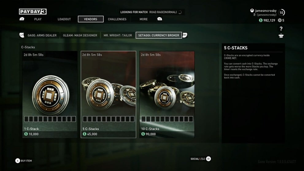
Unfortunately, the part of your brain that’s required to decipher the game’s best heist routes is also needed when it comes to navigating the user interface. Outside of heists, a selection of menus allows you to customize your character, invest points in skills, purchase cosmetics and currency, and view challenges. All standard stuff that, for good or ill, looks similar to just about every other interface in AAA gaming these days.
While the design might look nice though, actually using the thing proves to be a rotten time. Menus are hidden behind other menus, and things aren’t instinctively where you’d expect them to be. There’s a decent level of customization available for Payday 3’s weapons and wearables, but they’re tucked away behind the loadout screen. Why not have an entirely separate customization menu on the main menu? One that lets you tweak the look of all your gear in one place.
Navigating the UI with a controller uses the two sets of bumpers to scroll back and forth against different tiers of the menu. On paper, this always sounds sensible, and as such many games have adopted this method of getting around the screen. Personally, though I’ve always found it to be less intuitive in real use, often accidentally flicking across to a different top-tier menu when I wanted to move to a different second-tier menu or vice-versa.
Starfield is a particularly egregious recent example of this, but coming to Payday 3 (which is, admittedly, nowhere near as bad) after spending the past couple of weeks poking around in that game has made me realize just how aggravating the modern UI experience has become almost across the board. Perhaps it’s the current homogeneity of UI design that is partly responsible. The aesthetics are the same from one game to the next, so your brain expects them all to control the same. There’s just always minor variations that throw you off.
Payday 3’s Tutorial and Interface Are Generally Unhelpful
There are other annoyances about Payday 3’s presentation. A tutorial that plays nothing like an actual heist and therefore teaches you very little about the game. Floating markers that are supposed to point you towards important things in heists, but are never really explained what each one is indicating (this stuff used to be explained in instruction manuals, but we can’t have nice things anymore). The bland cutscenes feel shoehorned in and add nothing to the experience. Again, these are all things we’ve seen plenty of times before in other games.

The latest generation of consoles was sold on the promise of speed. With SSDs at the heart of our machines, features like Quick Resume, and energy-efficient rest modes, the barrier between parking yourself in your chair and getting stuck into a game was supposed to be virtually non-existent.
Payday 3 is just the latest game that ignores how important this actually is to players. We’re all too time-strapped to put up with typing our email addresses into on-screen keyboards and waiting around for password verification emails to come through. We have too many other pulls on our attention to warrant wasting our time trying to decipher your UI so that we can get what we really want out of your game.
I’ll be playing more of Payday 3 once it fixes its server issues. There are still a couple of heists I’ve yet to check out, and I’m eager to get a group of friends together to take a proper stab at the game’s optimal heist routes. It’s just a shame I’ll go into it with a slight sense of dread at having to contend with everything outside of those heists first.





Updated: Sep 23, 2023 01:40 pm