Let’s face it, unless you’re really passionate about your home city that happens to have an Overwatch League team in it, most people were just picking sides based on which Overwatch League team had the coolest jersey. So let’s settle it once and for all. Here are our picks for the coolest Overwatch League Jerseys.
Coolest Overwatch League Jerseys
20. Hangzhou Spark – Bottom 3 Coolest Overwatch League Jerseys
I know, I know. It’s a bummer to put the Spark dead last of the Overwatch League. As much as I want to love the bold choice of going for bright pink and blue, it just doesn’t work in practice. Maybe if the pink had been a secondary color or if the blue was darker it would be ok, but as it stands the Spark look like a squad of cotton candy soldiers. It’s cute at first, but quickly becomes an assault on the eyes.
Hopefully it grows on me in time, but right now the Spark just look off. Their look is striking, but not really in a good way. But maybe their ugly jerseys and skins are just a distraction tactic. If so, well played Hangzhou.
19. San Francisco Shock
Grey and orange is an….interesting choice. Focusing on a sort of drab and dark grey with orange text that is hard to even read doesn’t make the San Francisco Shock very shocking. Especially compared to some of the visually engaging styles we are about to get to, the Shock is fairly forgettable.
Luckily for San Francisco, they make up for their lack of style with their play. Currently sitting at fourth overall in the stage 1 rankings, they are doing fine despite the shade that we’re throwing here at Twinfinite.
18. Vancouver Titans
While the Titans have been killing it so far in their first Overwatch League season, their logo, jersey and character skins leave something to be desired. It seems they were going for a Seattle Seahawks sort of vibe but Vancouver’s green and blue clash with each other more than we would like. This along with a generic yeti logo that looks like a preset team in Madden makes the Titan’s overall style underwhelming.
While the Titans don’t look bad, they don’t look great either. However, these yeti titans don’t seem to be going away any time soon so we better get used to it.
17. Los Angeles Valiant
The Valiant are only a few shades of green off from being one of the higher teams on this list. The logo is iconic, the jerseys are sleek but the character skins are just plain ugly. For some reason, the green used in the actual game is a brighter, more limey green than what is used on all of their other team gear and it just doesn’t work.
The rest of the LA’s setup saves them from being in the bottom three but not by much. However, there’s not much we can do to get them out of the bottom of the stage 1 standings. At least things can’t get worse!
16. Florida Mayhem
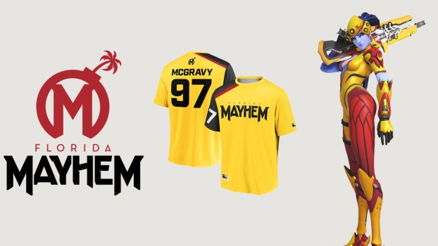
Florida sort of has a ketchup and mustard thing going on, huh? With an emphasis on a very loud yellow, highlighted by a very loud red, the Mayhem lack a certain restraint that we wish they had.
While the Shanghai Dragons have the same colors, their focus on red makes it work while the Mayhem look like a bunch of bananas. On the plus side, that logo is great, and McGravy might be the single best name in the Overwatch League.
Coolest Overwatch League Jerseys
15. Philadelphia Fusion
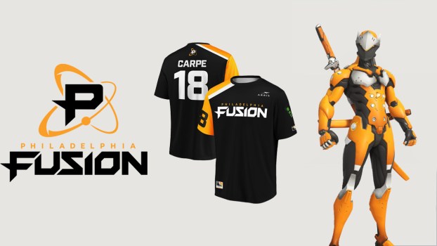
There’s not a whole lot to say about the Fusion. They have a “P” for Philly, a rather basic looking logo, basic sounding name and they basically just ripped off the main Overwatch color scheme. It’s all pretty basic, and in a league with some pretty sweet designs, basic isn’t going to rank you high.
Not that it’s all bad. Between the Fusion’s appearance in last year’s Grand Finals and some impressive games this season, the Philadelphia orange is becoming iconic. Also, the Philadelphia Flyer’s living meme of a mascot Gritty, didn’t even have to swap colors to come make an appearance in the Overwatch League, which is something we all appreciate.
14. Washington Justice
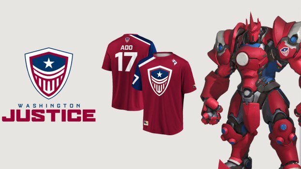
U-S-A! U-S-A! We’ve never seen a more patriotic team than the Washnington Justice. Hailing from D.C., sporting a Captain America shield on their chests and standing for Justice. It’s so abrasively American that it’s kind of funny, but we still enjoy it.
Sadly, there are just far more engaging designs in the league. We swear we aren’t picking on them for their record, we can just only take so much national pride in our teams.
13. Chengdu Hunters
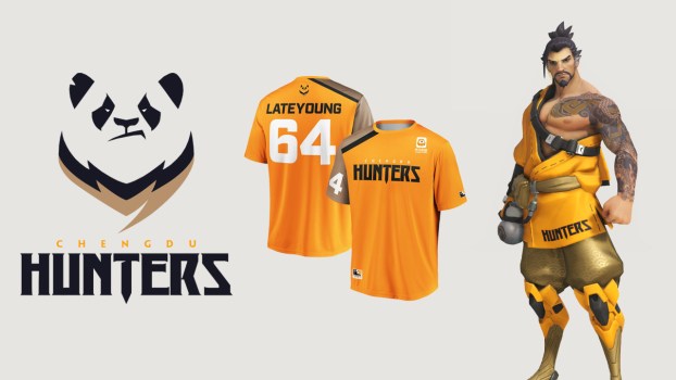
While somewhat similar to the Fusion’s colors, Chengdu makes better use of them. We like the slightly lighter orange with an interesting gold/brown highlighting it. It certainly sounds worse than it looks. It goes against the grain a bit, just like every comp that the Hunters run. They are in the front lines of the war on GOATS.
The disapproving panda is definitely one of the cooler logos in the league. The main criticism that can be thrown at Chengdu is that those jerseys don’t look nearly as good in person as they do in pictures. Whenever you see Chengdu play, the orange and gold sort of blend together and don’t look great. Aside from that, we are digging the Hunters’ look.
12. Toronto Defiant
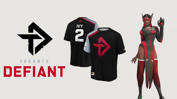
From this point onwards, all of these designs are good and have minimal problems. Bring on the nit picking! The Defiant certainly look good. The black, red and silver fit together great and with black as the focal point, the Defiant have an almost sinister feel to them, kind of like the Oakland Raiders in football.
The bummer is that they were announced right alongside the Atlanta Reign who have the same colors just shifted around and a better logo. The Defiant certainly look great, but they just don’t stand out quite as much as the Reign and the rest of their stylish competitors. Again, it’s a hard fight from here on out.
11. Boston Uprising
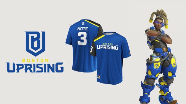
The Boston Uprising are the perfect example of the restraint we wish we saw from the Florida Mayhem and Hangzhou Spark. Boston uses a bright yellow, but it’s tastefully used to highlight the deep blue. Rather than shove bright colors in our face, the Uprising uses them sparingly, with a touch of black to seal the deal. It looks hot.
We wish Boston could be higher on this list, but sadly Boston just missed out on our top 10. Sad.
Coolest Overwatch League Jerseys
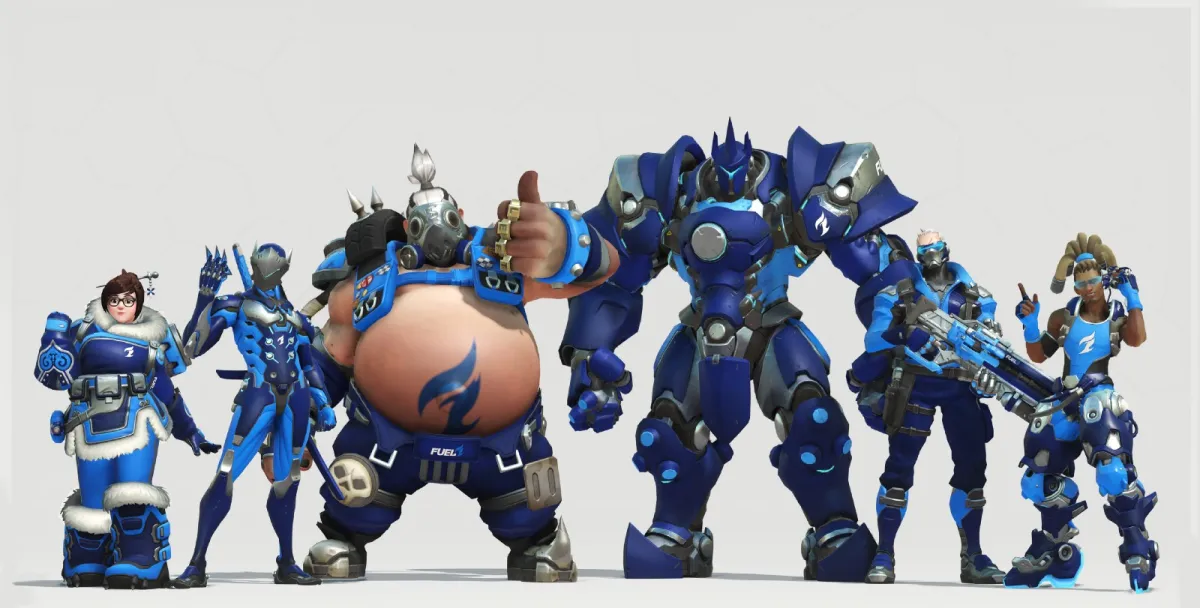
10. Dallas Fuel – Start of the Top 10 Coolest Overwatch League Jerseys
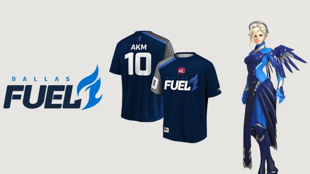
Dallas’ sleek blue on blue color scheme and flashy flame logo are almost cool enough for us to forgive the giant tacky Jack in the Box logo on their chest. Almost. Seriously, why can’t we watch aKm pop off without being forced to think about that terrifying clown?
Bad fast food aside, we love the Fuel. They have a simpler style than some other teams but it really works for them. Burn blue!
9. London Spitfire
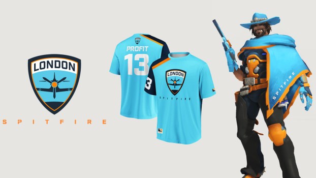
The champions of Overwatch League’s inaugural season won their title in style. While bright colors can be a problem as we have pointed out on this list, London’s use of black, orange and white allow the iconic blue to shine. It’s eye-catching, but in the good way this time.
Also, we have to talk about the logo. The plane refers to the Spitfire plane used by British Air Force in World War II, serving as an great nod to their home country. Also, it just looks great. The shield design makes for eaily one of the most classy and sleek logos in the league.
8. Atlanta Reign
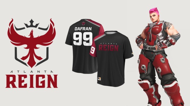
As we said before, the Reign are kind of just the slightly better version of the Defiant as far as design (and maybe in Overwatch as well with that 3-1 win a few weeks ago). The dark red, grey and black, along with the phoenix logo gives Atlanta a regal and royal vibe.
Similar to the Spitfire, the Pheonix is also a sort of reference to the team’s home. The official city seal for Atlanta features a pheonix and is meant to represent “the rebuilding of the city after it was burned and destroyed by war.” And who doesn’t love seeing Dafran go off as Torbjörn with a firey pheonix on his shoulder? Nobody.
7. Shanghai Dragons
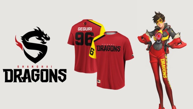
It’s amazing what a color swap can do. Even though Shanghai has the same colors as the Florida Mayhem, the focus on red instead of yellow does wonders and the red, yellow and black and the dragon mascot both give off a distinctly Chinese identity that is perfect for China’s largest city.
We also have to give a shout out to that dragon logo. While Shanghai might have struggled last year, they were undefeated in fashion and style.
6. Guangzhou Charge
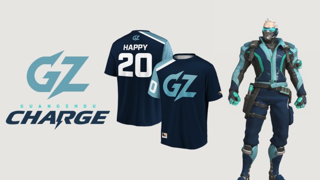
The Charge does has a similar blue on blue style to Dallas Fuel, but, in our opinion, the charge do it better. The design might seem simplistic, with a simple “GZ” for a logo and a monochromatic color scheme, but that’s kind of what makes it great.
The cyan and sea green highlights give Guangzhou a retro-looking aesthetic without being too loud about it. It all just flows together nicely, and while they don’t necessarily stand out as much as other teams, for them, that really isn’t a problem.
Coolest Overwatch League Jerseys
5. Paris Eternal – Top 5 Coolest Overwatch League Jerseys
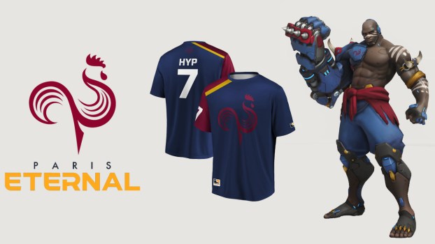
The Paris Eternal might have the best colors in the league. The red and blue that would seem so boring and redundant for sports teams is completely changed by the strips of golds used in the jersey, character skins and logo text. This combo give Paris an immediately identifiable style.
Like some of previous teams, the Eternal have references to their home city. The Eternal represents the eternal flame that burns under the Arc de Triomphe in Paris in memory of fallen soldiers while the rooster represents the Gallic Rooster, a french national symbol. The only downside for Paris is that sometimes they make the Rooster so dark it’s hard to see, which seems to be a problem for multiple teams.
4. Houston Outlaws
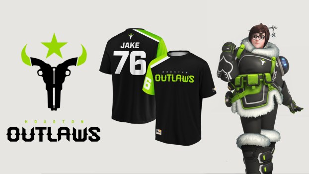
It’s hard not to love the Houston Outlaws. From a branding perspective, everything is just great. A Texas team with a cowboy theme, that incredible logo of dual guns making the shape of a longhorn, the neon green on black, it all just oozes cool.
The Outlaws are for sure one of the most unique teams in the league when it comes to visual style. I’m not even an Outlaws fan and I want to sport the green and black.
3. New York Excelsior – Top 3 Coolest Overwatch League Jerseys
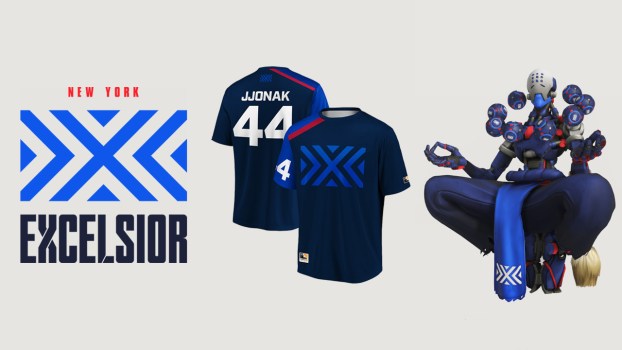
Something about the New York Excelsior’s design just looks like a team that would dominate the league. Maybe it’s the similarity to the Patriots? I mean, JJonak is basically the Tom Brady of the Overwatch League so it sort of feels right.
New York’s insane skill aside, this is an iconic design that’s hard to beat. The logo is very different from other teams, looking more like a flag than a logo but it works. The blue on blue with a touch of red looks like the clean and classy vibe of a bonafide dynasty (the real kind, not the Seoul kind). We can already sense the hate this flag will bring after watching New York win 6 of the next 8 championships. You may hate them, but you have to respect them.
2. Los Angeles Gladiators
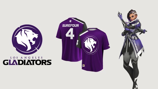
This was hard. On the right day we could be convinced to give the Gladiators the top honor on this list, but today is not that day. That being said, the Gladiators look incredible. With so many teams borrowing each others styles and colors, the Gladiators deep purple and black under a furious white lion is a huge stand out among the pack.
While the logo and jerseys are great, the character skins are where this team really shines. Every character in the game just looks epic in that purple and black. With teams out here looking like cotton candy and mustard, LA severely outclasses much of its competition.
1. Seoul Dynasty
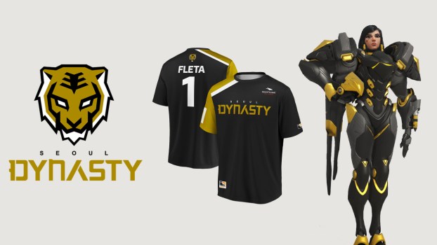
Here we are. Our pick for the best looking team in the Overwatch League is the Seoul Dynasty. While they have a simpler design that others in the league, there is a reason for that. the gold, black and white just makes Seoul look important. From looks alone, it feels like Seoul should be one of the league’s best.
This is helped by a pristine logo. The tiger, meant to represent Korean culture, is, without a doubt, our favorite logo in the league. the merch, the character skins, the logo, it’s all top-class. Now, we will say that if Seoul doesn’t pick up their game, the choice to call themselves a Dynasty before they actually create a Dynasty will definitely blow up in their face. But, if they start to dominate, it will make victory all the sweeter.
Do you agree with our list? What teams do you think look the best? Which do you think look the worst? Let us know in the comments!
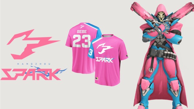
#20 - Hangzhou Spark
Hopefully it grows on us in time, but right now the Spark just look off. Their look is striking, but not really in a good way. However, maybe their ugly jerseys and skins are just a distraction tactic. If so, well played Hangzhou.
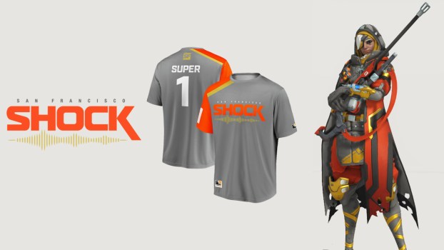
#19 - San Francisco Shock
Luckily for San Francisco, they make up for their lack of style with their play. Currently sitting at fourth overall in the stage 1 rankings, they are doing just fine in spite of our shade.
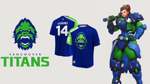
#18 - Vancouver Titans
While the Titans don't look bad, they don't look great either. However, these yeti titans don't seem to be going away any time soon so we better get used to it.
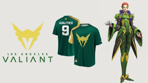
#17 - Los Angeles Valiant
The rest of the LA's setup saves them from being in the bottom three but not by much. However, there's not much we can do to get them out of the bottom of the stage 1 standings. At least things can't get worse!
#16 - Florida Mayhem
While the Shanghai Dragons have the same colors, their focus on red makes it work while the Mayhem look like a bunch of bananas. On the plus side, that logo is great, and McGravy might be the single best name in the Overwatch League.
#15 - Philadelphia Fusion
Not that it's all bad. Between the Fusion's appearance in last year's Grand Finals and some impressive games this season, the Philadelphia orange is becoming iconic. Also, the Philadelphia Flyer's living meme of a mascot, Gritty, didn't even have to swap colors to come make an appearance in OWL, which is something we all appreciate.
#14 - Washington Justice
Sadly, there are just far more engaging designs in the league. We swear we aren't picking on them for their record, we can just only take so much national pride in our teams.
#13 - Chengdu Hunters
The disapproving panda is definitely one of the cooler logos in the league. The main criticism that can be thrown at Chengdu is that those jerseys don't look nearly as good in person as they do in pictures. Whenever you see Chengdu play, the orange and gold sort of blend together and don't look great. Aside from that, we are digging the Hunters' look.
#12 - Toronto Defiant
The bummer is that they were announced right alongside the Atlanta Reign who have the same colors just shifted around and a better logo. The Defiant certainly look great, but they just don't stand out quite as much as the Reign and the rest of their stylish competitors. Again, it's a hard fight from here on out.
#11 - Boston Uprising
#10 - Dallas Fuel
Bad fast food aside, we love the Fuel. They have a simpler style than some other teams but it really works for them. Burn blue!
#9 - London Spitfire
Also, we have to talk about the logo. The plane refers to the Spitfire plane used by British Air Force in World War II, serving as an great nod to their home country. Also, it just looks great. The shield design makes for eaily one of the most classy logos in the league.
#8 - Atlanta Reign
Similar to the Spitfire, the Phoenix is also a sort of reference to the team's home. The official city seal for Atlanta features a Phoenix and is meant to represent "the rebuilding of the city after it was burned and destroyed by war." And who doesn't love seeing Dafran go off as Torbjörn with a fiery Phoenix on his shoulder? Nobody.
#7 - Shanghai Dragons
We also have to give a shout out to that dragon logo. While Shanghai might have struggled last year, they were undefeated in fashion and style.
#6 - Guangzhou Charge
The cyan and sea green highlights give Guangzhou a retro-looking aesthetic without being too loud about it. It all just flows together nicely, and while they don't necessarily stand out as much as other teams, for them, that really isn't a problem.
#5 - Paris Eternal
Like some of previous teams, the Eternal have references to their home city. The Eternal represents the eternal flame that burns under the Arc de Triomphe in Paris in memory of fallen soldiers while the rooster represents the Gallic Rooster, a french national symbol. The only downside for Paris is that sometimes they make the Rooster so dark it's hard to see, which seems to be a problem for multiple teams.
#4 - Houston Outlaws
The Outlaws are for sure one of the most unique teams in the league when it comes to visual style. I'm not even an Outlaws fan and I want to sport the green and black.
#3 - New York Excelsior
New York's insane skill aside, this is an iconic design that's hard to beat. The logo is very different from other teams, looking more like a flag than a logo but it works. The blue on blue with a touch of red looks like the clean and classy vibe of a bonafide dynasty (the real kind, not the Seoul kind). We can already sense the hate this flag will bring after watching New York win 6 of the next 8 championships. You may hate them, but you have to respect them.
#2 - Los Angeles Gladiators
While the logo and jerseys are great, the character skins are where this team really shines. Every character in the game just looks epic in that purple and black. With teams out here looking like cotton candy and mustard, LA severely outclasses much of its competition.
#1 - Seoul Dynasty
This is helped by a pristine logo. The tiger, meant to represent Korean culture, is, without a doubt, our favorite logo in the league. the merch, the character skins, the logo, it's all top-class. Now, we will say that if Seoul doesn't pick up their game, the choice to call themselves a Dynasty before they actually create a Dynasty will definitely blow up in their face. But, if they start to dominate, it will make victory all the sweeter.
Do you agree with our list? What teams do you think look the best? Which do you think look the worst? Let us know in the comments!







Updated: Mar 11, 2019 04:14 pm