People say don’t judge a book by its cover, but, well, people do. How many books are ignored because they don’t look appealing when you walk past them? The same applies to video games, too. Even if today the internet provides consumers with a plethora of news, preview, and video footage, box art still matters. But it is increasingly ignored, and some of the very best games are still to this day spoiled by awful box art.
Mass Effect 2
I think most Mass Effect fans agree that the second game in the series represents the high water mark for the series. Somewhere between the full-on RPG of the original and the third-person shooter of the third game, Mass Effect 2’s gameplay, story, and characters are top notch. The box art, though… not so much.<br><br> Seriously, what is going on with that pose Shepard is in? It just doesn’t look natural. You’d hardly look at that cover and think, hm, intergalactic space-epic with a spellbinding story and incredible characters. It looks more like a b-grade space film.
Heavy Rain
If you ask me, the key to good box art is telling you something about the game while at the same time incorporating an element of mystery. The aesthetic needs to be stimulating –compelling in some way, whether it’s a unique art style, font, or even the composition of the graphic. Heavy Rain’s US cover doesn’t really have any of that. <br><br>
For a AAA game that was looking to penetrate a video game market full of shooters, RPGs, and open world adventure games back in 2010, you’d have thought the publishers would have gone all out trying to capture audiences with an exciting bit of box art. Nope. Not even a little bit. There’s just nothing interesting about this design, and while the grayscale obviously has its links to the game, it doesn’t do anything here to enhance the appeal of the cover.
Left 4 Dead
What comes to your mind when you think of Left 4 Dead? Hordes of zombies, shrieking witches appearing from nowhere, and the general chaos of co-operative shooting action, right? How much of that is conveyed by Left 4 Dead’s box art? Precisely zero. So what do we get? Err, fingers… ok.
Megaman
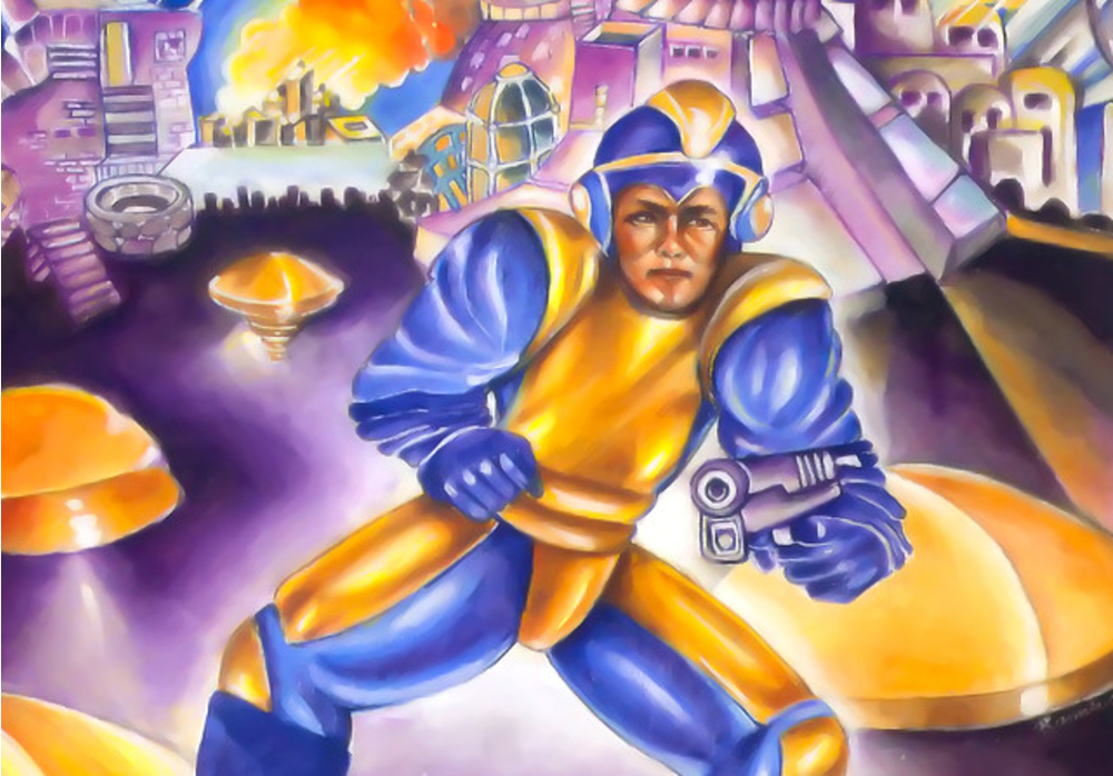
Megaman released in 1987, which was the year I was born. That’s an awfully long time ago and you could honestly make an entire list about horrible box art from the late 80s and early 90s, but Megaman is a special case. This is the game that kicked off one of the most critically acclaimed and longest-standing video game franchises ever, and look just look at that cover! My word.<br><br>
Honestly, Keiji Inafune, did your five-year-old cousin draw that box art? I think it’s time to spill the beans. It really does look like a wonky bit of fan art drawn by a young child with a pencil and crayon. And yet, it birthed such a massively successful franchise… Ironically, Megaman’s design and aesthetic quickly moved away from, well, whatever that is supposed to be. Megaman became Megaboy, really, with a quirkier, more whimsical design… and thank goodness for that.
Resident Evil 4
Resident Evil 4 is a particularly bizarre case of bad box art. Up until then, Capcom had absolutely nailed every mainline game in the series’ box art; the original with its iconic zombie/spider wallpapered effect closing in on the gunman; the sequel with its terrifying burnt black and white zombie, and then who could forget Nemesis?<br>br>
But what exactly is going on with 4? It’s just Leon looking slightly camp with crazy chainsaw zombies in the background. It’s not particularly scary, and it deviates from using a graphic or art style different from the in-game graphics to create any sense of mystery or wonder. Maybe it was all the years of Resident Evil spin-offs between Nemesis and 4 that everyone at Capcom dropped their standards?
Resident Evil 6
…and then Capcom went and outdid itself. What on earth is going on with this logo? Look closely. Once you see it you will never unsee it.<br><br>
Even if the design avoided unwanted comparisons, this just isn’t a compelling design. Peak laziness.
Metal Gear Solid 4: Guns of the Patriots
Another case of a franchise known for its sublime box art completely dropping the ball with its fourth entry in the series, Metal Gear Solid 4 just didn’t live up to its predecessors. Esteemed artists Yoji Shinkawa’s iconic art style had been used on all the covers up until this point, and it really took the gloss off the box art of 4, which is just a close up of Old-Snake<br><br>
Of course, there was a special edition that featured the artwork and looked significantly better but hiding that behind a paywall was a strange choice, indeed.
Ico
I think it’s obvious that the publishing department for the North American release was sure that having the game’s protagonist wielding a sword and looking tough would help the game’s commercial performance, but it completely misses the mark. <br><br>By comparison, the EU/Japanese version so perfectly summarizes exactly what Ico is all about: the art style, the puzzle mechanics, the handholding, the sense of mystery is all there.
BioShock Infinite
BioShock burst onto the FPS scene because it stood apart from other games in the genre. It fused role-playing, survival horror, and shooting mechanics into one exceptional story-driven experience, and there was nothing else quite like it. The series’ uniqueness was a core aspect of its popularity, and so you can imagine the disappointment when BioShock Infinite’s box art looked so dull and generic.<br><br>
Quizzed as to why such a decision was made, Levine explained that the team had toured frat houses to discover the extent of the game’s popularity. Unsurprisingly, the fraternity jocks had no idea what BioShock was, and so we got this monstrosity…
The Orange Box
There may never again be so many excellent games in a single package. The Orange Box was a must-have compilation of Valve’s most acclaimed games, and yet its box art was so utterly atrocious. The minimal amount of effort that’s gone into the composition of this design actually makes us question whether we should even utter “art” in the same sentence. It seriously looks like somebody has whipped this one up in photoshop hours before sending it to print.
Batman Arkham City: GOTY Edition
A game of the year edition should be a cause for celebration, but not like this. Oh, hell no. What Rocksteady and Warner Bros. were thinking with this one, I’m not sure. I mean there’s so many quotes and scores plastered all over the cover it’s hard to tell what the hell we’re even buying! <br><br>
Seriously, is the game called 10 out of 10? The friggin’ logo and the actual name of the game is barely legible! What a travesty.
Blood Omen: Legacy of Kain
Owners of the PlayStation version of Blood Omen didn’t have to avert their eyes from the abomination you see above, but Windows players weren’t so lucky.<br><br>
What’s particularly amusing is that the design isn’t actually a render from the game; Legacy of Kain is a 2D isometric game. So what you’re actually seeing above is state of the art 3D renders specifically for this cover art. Yeah, way too soon for that in hindsight.
That does it for our list of great games with Ugly box art. Search Twinfinite for similar content.
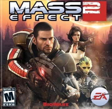
Mass Effect 2
Seriously, what is going on with that pose Shepard is in? It just doesn't look natural. You'd hardly look at that cover and think, hm, intergalactic space-epic with a spellbinding story and incredible characters. It looks more like a b-grade space film.
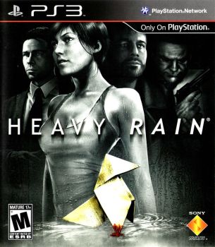
Heavy Rain
For a AAA game that was looking to penetrate a video game market full of shooters, RPGs, and open world adventure games back in 2010, you'd have thought the publishers would have gone all out trying to capture audiences with an exciting bit of box art. Nope. Not even a little bit. There's just nothing interesting about this design, and while the grayscale obviously has its links to the game, it doesn't do anything here to enhance the appeal of the cover.

Left 4 Dead
Now, before you go comparing Dead Space as a similar example I haven't called out here, let me tell you what it isn't the same: a) it's a severed arm and dismemberment was a huge part of the game b) it's literally floating through space... dead space. Much cleverer!

Mega Man
Honestly, Keiji Inafune, did your five-year-old cousin draw that box art? I think it's time to spill the beans. It really does look like a wonky bit of fan art drawn by a young child with a pencil and crayon. And yet, it birthed such a massively successful franchise... Ironically, Mega Man's design and aesthetic quickly moved away from, well, whatever that is supposed to be. Mega Man became Mega Man, really, with a quirkier, more whimsical design... and thank goodness for that.
Note the "state-of-the-art" and "high-resolution graphics" labels at the very top. I think even in 1987 consumers would have been raising an eyebrow there.

Resident Evil 4
> But what exactly is going on with 4? It's just Leon looking slightly camp with crazy chainsaw zombies in the background. It's not particularly scary and doesn't create that same sense of survival horror. But then again, this was essentially the turning point in the franchise, when Capcom decided Resident Evil would go down the action game route. It wouldn't be long before Chris Redfield was putting boulders... (shudder).
Notably, it's also the first mainline game to deviate from using a graphic or art style different from the in-game graphics, and without that it misses the mark in creating any sense of mystery, wonder, and foreboding.
Maybe it was all the years of Resident Evil spin-offs between Nemesis and 4 that everyone at Capcom dropped their standards?

Resident Evil 6
Even if the design avoided unwanted comparisons, this just isn't a compelling design. Peak laziness.
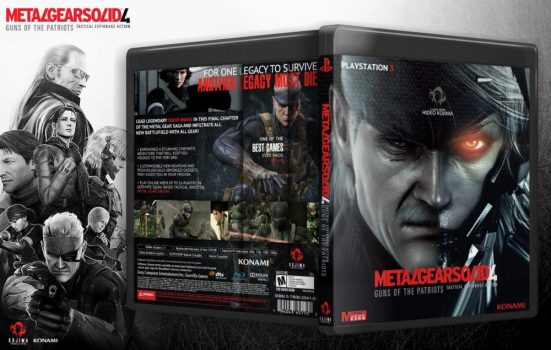
Metal Gear Solid 4: Guns of the Patriots
Of course, the Japanese version of the game featured Shinkawa's art, and there was a special edition available for western consumers that featured the artwork and looked significantly better, but hiding that behind a paywall was a strange choice.
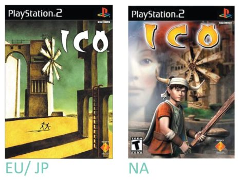
Ico
I think it's obvious that the publishing department for the North American release was sure that having the game's protagonist wielding a sword and looking tough would help the game's commercial performance, but it completely misses the mark.
By comparison, the EU/Japanese version so perfectly summarizes exactly what Ico is all about: the art style, the puzzle mechanics, the handholding, the sense of mystery is all there.

BioShock Infinite
Quizzed as to why such a decision was made, Levine explained that the team had toured frat houses to discover the extent of the game's popularity. Unsurprisingly, the fraternity jocks had no idea what BioShock was, and so we got this monstrosity...

The Orange Box
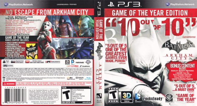
Batman Akrham City GOTY Edition
Seriously, is the game called 10 out of 10? The friggin' logo and the actual name of the game is barely legible! What a travesty.
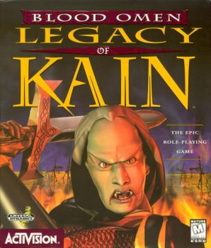
Blood Omen: Legacy of Kain
What's particularly amusing is that the design isn't actually a render from the game; Legacy of Kain is a 2D isometric game. So what you're actually seeing above is state of the art 3D renders specifically for this cover art. Yeah, way too soon for that in hindsight.







Updated: May 6, 2019 09:32 am