When the Internet learned of Raichu’s long-lost evolution Gorochu, Nintendo Wire was one of the first to create a mock-up of the Pokemon. The design has the “bared fangs” and horns” that were supposed to be in the original design, but otherwise it’s just a photoshopped Raichu.
Aww, who’s a cute little Gorochu? You are! Yes you are!
(ahem)
Sorry about that, but this design by EmdyOfficial is just so darn adorable! It looks like a pudgy little Raichu with big ‘ol devil horns and a cute little tail. Plus, it keeps the burnt orange coloring from Nintendo Wire’s design. Most important of all, EmdyOfficial almost perfectly copies the art style of the Pokemon games, and the look on Gorochu’s face just sells the design. This Pokemon design is the right kind of doofy, but what can you expect from a guy who has made countless Pokemon fan concepts and designs?
At first glance, this Gorochu concept, drawn by KyephaFakemon looks incredible. It has the fangs and the horns, albeit antennae-like horns (or horn-like antennae). The extra fluff and ear hooks look nice, and the whiskers are cute if a little weird, but this design just doesn’t do enough to make it feel like a proper Raichu evolution. On the bright side, though, if Nintendo ever wants to give Raichu a new regional variant or a mega evolution, KyephaFakemon’s design could lay the groundwork.
Pikachu looks cute. Raikou looks terrifying. Yet despite looking like a cross between the two, GlitchedMess‘ idea for Gorochu comes off as less than the sum of its parts. The extra electric sac on its forehead is a nice attempt but ultimately fails to save the design (stick around to see that idea done right), as everything else about this picture seems like it’s trying to be edgy without understanding what made the original Pichu, Pikachu, and Raichu designs so appealing. The massive claws, thunderclouds on the neck and tail, and the jagged Raikou fangs look out of place and goofy rather than ferocious.
The Gorochu drawn by Foxeaf takes Nintendo Wire and Alex Holdway’s concept and ups the level of awesomeness. This Pokemon retains the burnt orange coloring; but now the horns are huge and imposing; the ears have morphed into membranes that are connected to what appears to be more horns, and the back fur sticks up as if it’s got permanent static cling, which is fitting. Oh, and Pichu/Pikachu/Raichu’s signature electric cheek sacs have undergone quite the metamorphosis. Not only does Gorochu sport a third sac on its forehead, but now all the sacs are shaped like the symbols emblazoned the drums of Raijin, the Japanese god of thunder and lightning. Now that’s how you properly add a third electric sac.
Ships-Queen‘s Gorochu is halfway between EmdyOfficial’s adorkably cute design and KyephaFakemon’s concept. This version has all the features of a Raichu plus some neck floof and squat horns, and its ears are shaped like lightning bolts, which is a plus. But, this idea just looks too much like a Raichu to be considered a proper evolution. This is another design that would work better as a mega evolution.
Unlike Ship-Queen’s version of Gorochu, Alan‘s take looks like a proper evolution. This version’s ears are different (and bat-like); it sports a darker coat, and it has two large toes. Also, I can’t tell if the cloud is a part of the Pokemon’s body or an actual cloud, but it complements that devilish grin. Clearly this Gorochu has been taking intimidation lessons from Thundurus, and it’s paying off.
This idea for Gorochu is yet another one that works more as a mega evolution than as an actual evolution. Mario-19‘s dark coat and blue ears, tail, electric sac, horns, and forelimbs are highly reminiscent of Mega Charizard X. That’s not to say they aren’t good design choices. Heck, the lighting-shaped horns are beautiful, and the Raijin drum symbols are adorable and make me want to rub the Gorochu’s belly. But, these additions don’t do enough to make this Pokemon look like a new species.
Before I start examining CRANTIME‘s drawing, I need to state that I have nothing against the art style. It’s a cool design, but CRANTIME drew something that just isn’t related to a Pikachu. If I wasn’t told it was supposed to be a Gorochu, I would assume it was a fire-breathing Digimon inspired by Darmanitan, not a Pokemon that can call down lightning. While plenty of Gorochu designs feature some semi-demonic features, namely short and squat horns reminiscent of anime portrayals of Oni, this version is straight up impish with none of the original mouse/squirrel influences. Conceptually, this design is cool; it could make for a great standalone creature, but as an evolution of Raichu, it falls somewhat flat.
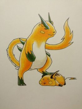
NoCupcake‘s Gorochu has traded in its mouse and squirrel tendencies for a more ferret or weasel-like body. This isn’t the only fan-concept that radically changes the body shape, but the rest of the design is less than impressive The eyebrow horns are a neat touch, but this Pokemon lacks the angular tail meant to look like a lightning bolt present in all its pre-evolutions. Moreover, why are there spikes jutting out of its back? I know it’s an odd sticking point, but the back spikes seem like a superfluous feature. This Pokemon looks less like it evolved from a Raichu and more like it evolved from a Pikachu-like Pokemon like Dedenne.
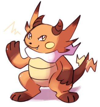
And here we have another example of a cool concept that is at odds with itself. Monomite‘s Gorochu is cute, but it doesn’t look like it could ever evolve from a Raichu. The face is too catlike and the tail, well, much like NoCupcake’s Gorochu, it isn’t the lightning bolt-esque angular tail synonymous with the Pikachu line. This is, again, a great design for a Pokemon that could evolve from something meant to be a not-Pikachu. The triple-tipped ears look fantastic, the scaly belly is adorable, and the smirk gives it one heck of a personality, but it just doesn’t work as an evolution of a Raichu.
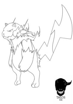
Even though this Gorochu design uses the same ferret/weasel body style as NoCupcake’s version, Talos1NK‘s idea works way better. The tail, while long, is still angular and lightning-shaped like its predecessors, and its horns are just short and stubby enough to give off the illusion they’re actually ears. Plus, the electric sacs have adopted a lighting shape, which is all sorts of awesome. While this design looks like it would be at home in Yo-Kai Watch, it also oddly works for an evolution of Raichu.
I would be remiss if I didn’t mention this design.
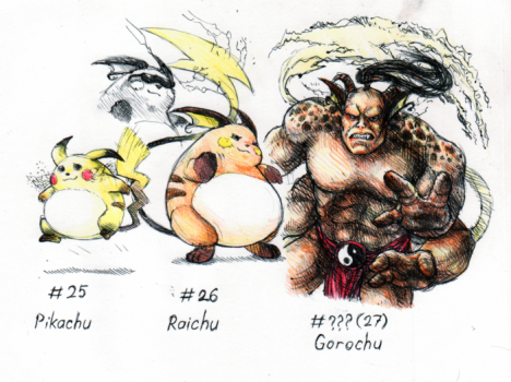
Neutral-Demon‘s concept for Gorochu is just the Mortal Kombat villain Goro with Raichu ears. It’s silly, stupid, and awesome at the same time. Don’t read too much into it, though; it’s just a pun for pun’s sake.
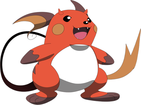
Gorochu
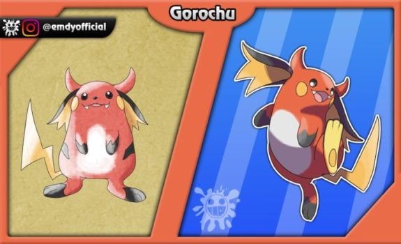
Adorably Cute Gorochu
(ahem)
Sorry about that, but this design by EmdyOfficial is just so darn adorable! It looks like a pudgy little Raichu with big 'ol devil horns and a cute little tail. Plus, it keeps the burnt orange coloring from Nintendo Wire's design. Most importantly, EmdyOfficial almost perfectly copies the art style of the Pokemon games, and the look on Gorochu's face just sells the design.
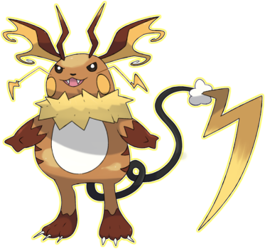
Mega Evolution Gorochu?
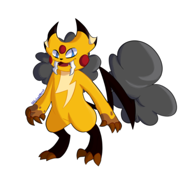
What in Arceus' Name Gorochu
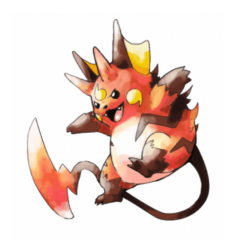
Bad Ass Gorochu
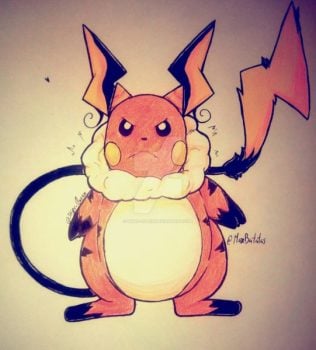
Raichu With Horns Gorochu
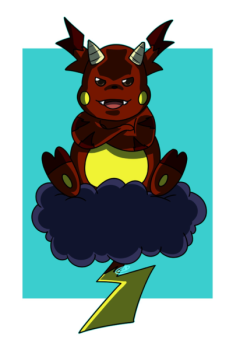
Impish Gorochu
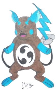
Mega Charizard X Gorochu
Ferrety Gorochu
Cat-like Gorochu
Yo-Kai Gorochu







Updated: May 28, 2018 11:23 am