Super Mario RPG: Legend of the Seven Stars first captivated players with its release in 1996 on the SNES, blending Square’s classic RPG elements with the beloved Mario universe. Now, 27 years later, the game has been reimagined through a remake on the Nintendo Switch, simply titled Super Mario RPG.
We can experience the transformation that the game has gone through with side-by-side screenshots, where each pair of images contrasts the original game’s charm with the Switch’s modern visuals.
This comparison takes us through the evolution of the game’s art, from pixelated sprites to crisp, contemporary graphics. It highlights the technological leaps since the release of the original game while still managing to capture the nostalgia for those who played it way back then.
Here are 12 side-by-side screenshots to show you just how much the game has changed. Special thanks to our Reviews Editor Zhiqing Wan for providing the screenshots for the Switch version of the game.


The first thing players see when they boot up the game is the title screen. Back then on the SNES, it had the subtitle “Legend of the Seven Stars.” Now, on the Switch, the game is titled “Super Mario RPG” with no subtitle.
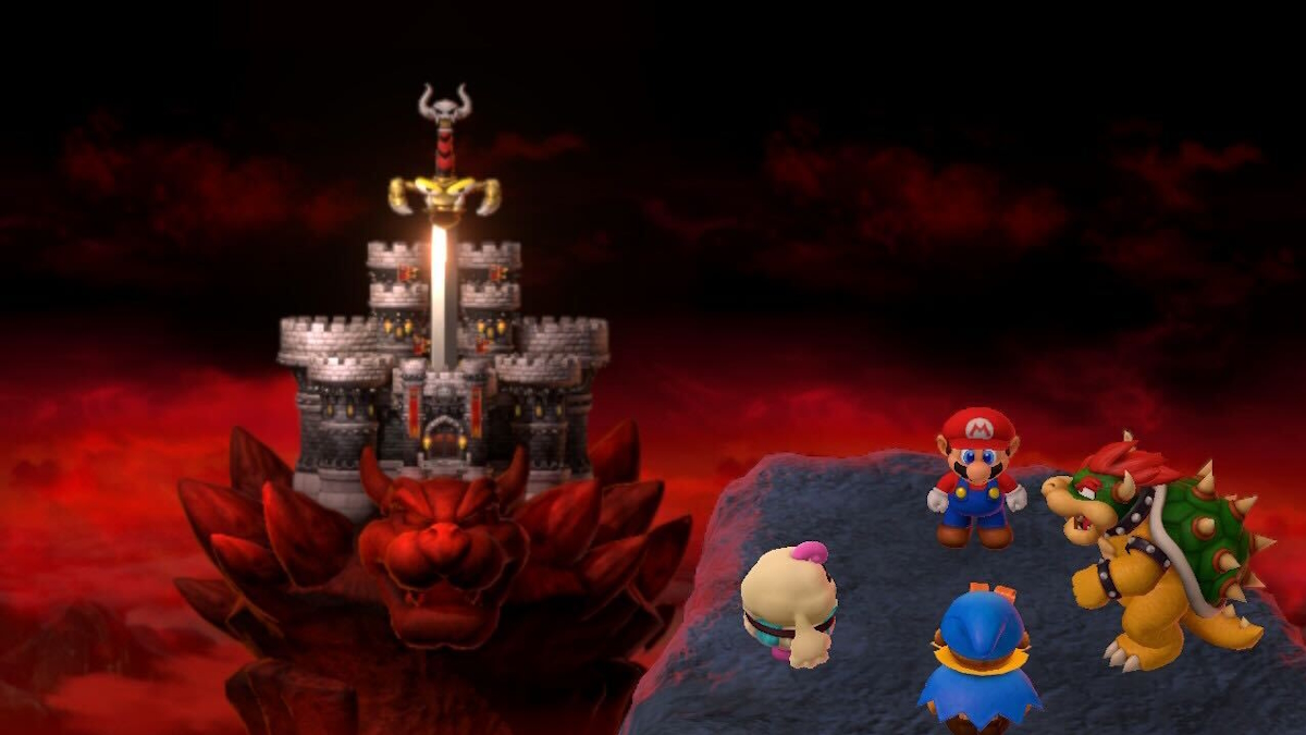
Just like in the original, we get our first look at Bowser’s Keep, with the iconic sword Exor impaling it. This time, it is much more detailed, and we can see the night sky with shooting stars behind it.


The Toads’ houses in the Mushroom Kingdom have quite the upgrade. Everything is placed exactly the same way, but now they have red curtains instead of green as well as fancy red rugs.
The remake does a great job with placing even the most mundane items and decorations in the exact same spots, of course with beautifully detailed texture upgrades.


The world map is one of the nicest upgrades in the remake. You can actually see the entire island instead of the land being in a black void like in the original game.
The layout stays true to the SNES game, though. Everything is laid out in the right spot, and there’s more room to see details on the map that we couldn’t before.


Enemy battles look mostly similar, but the UI information looks a bit differently in the remake. We now have HP bars to give a better visualization of the party members’ health. You can also see how many Flower Points are available to use.
Again, just like in the world map, the battles no longer take place on land in a void. You can see the surrounding areas on the sides of the screen this time.


Dialogue boxes look drastically different in the remake. Instead of on a parchment paper-like design with a unique font, the dialogue boxes in the remake look a lot more plain. The text is smaller but in an easier-to-read font. Also, the box doesn’t stretch across the entire screen. This means we can see more of what’s going on in the scene than we could before.


Here’s another look at a battle, this time during a boss fight. It’s impressive how the developers were able to capture the look of Bowyer exactly how he was in the original game just based off of his sprite.
As you can see, the aesthetic from the SNES version of the game has been totally preserved in every way,. This time, though, it has better details and high graphical fidelity.


One of the more surprising changes involves the scenes in which Mario and his friends earn a star. Instead of remaining in the scene that it takes place, the character enter a dedicated screen where you can see them much closer up as they receive the star.
This gives us a much better look at their character models in a way that we wouldn’t normally get to see.


Those who played the original game surely remember the mine cart mini game in the Mole Mines. While much of it looks quite familiar, it has undergone some quality of life changes in the remake.
For example, you can see in the righthand corner a speedometer, which is helpful for knowing when to break. The lefthand corner shows the mini game’s controls, which the original did not have.
A detail you might have missed is that you can see Dyna the mole sitting in the cart with Mario. In the original, she was supposed to be there with him, but she isn’t actually visible.


Here’s a look of the mine cart mini game towards the end when the cart goes outside. We can see that the sky has gotten a beautiful touch-up here.


Here is another example of the dialogue boxes, this time also showing the exterior of houses in Moleville. Interestingly, Snifits have a new name in the remake. They are now “Snifsters.”
As you can see, nearly everything sits exactly where it did in the original. Even the patterns in the patches of grass are the same.


Here’s one more look at the world map, this time showcasing the area around Booster Tower. Everything is much easier to see, with details down to paths and windows.


Finally, we have one more look of Bowser’s Keep. This time it is directly during gameplay and from the perspective of Vista Hill. Mario can visit this at any point in the game starting from the very beginning since it is just east of his pad.
Will this be your first time playing Super Mario RPG? Or will you be returning to this classic after having played the original release? If you are still on the fence about buying it, you can read our official review right here to help you decide.







Updated: Nov 17, 2023 10:09 am