The Crash Bandicoot N’Sane Trilogy was an incredible remaster of three PlayStation classics, updating them for the modern age with stunning graphical quality. Now it’s Spyro’s turn with the Spyro Reignited Trilogy, bringing the original three games to modern consoles with a gorgeous update.
The Reignited Trilogy packs in Spyro the Dragon, Ripto’s Rage, and Year of the Dragon, all remade with Unreal Engine 4. There are a variety of changes brought to the games, but simply looking at the original and the remakes side by side shows just how much work has gone into the graphical update. We’ve compiled a few in-game screenshots put next to their original counterparts just to illustrate how drastic this difference is. You can click on each image to bring up a full-size view.
Spyro The Dragon
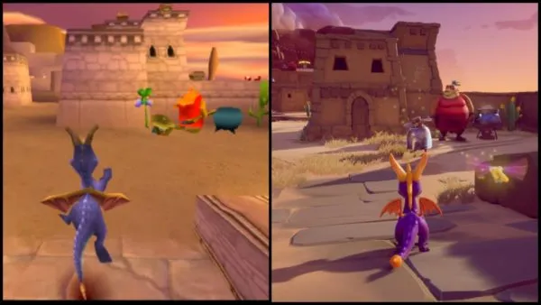
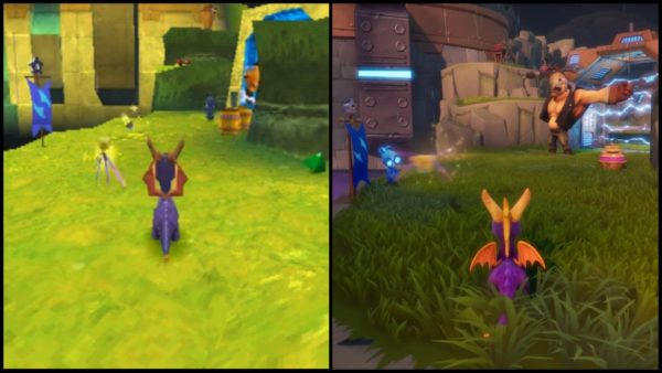
Each and every area in the Reignited Trilogy has been completely overhauled and re-imagined. This is in terms of graphical quality and aesthetic design, of course, as the actual layout of areas stay exactly the same as the original games. These areas still retain their basic inspirations but are much more fleshed out in terms of overall detail.
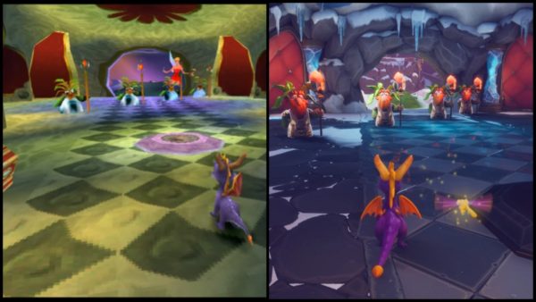
Looking at the images of Cliff Town above the area provides much more detail to the buildings and lines the ground with stones and tiles. Meanwhile, the enemy’s metal cape gives off a reflective shine. Moving to the Magic Crafters Worlds, you can see how drastically redesigned some of the enemies have been in the trilogy. This world also has a much colder/icier feel than it ever had before.
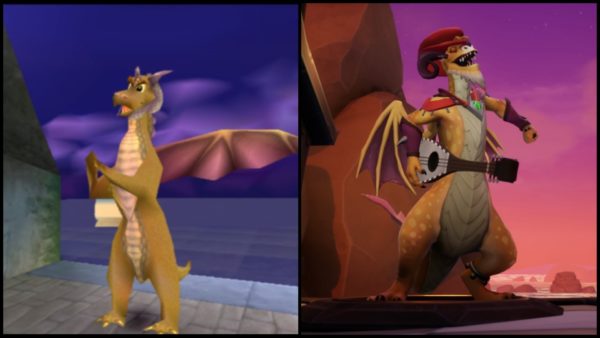
One of the most impressive changes brought to the first Spyro game is with the drastic redesigns that have happened to all the dragons Spyro saves. In the original these dragons were mostly generic palate swaps of each other, but in the Reignited Trilogy each and every one has a unique design. The one we’ve featured is Tomas in Gnorc’s Cove, but it’s great fun to see how different and imaginative each dragon is in the remake.
Spyro: Ripto’s Rage
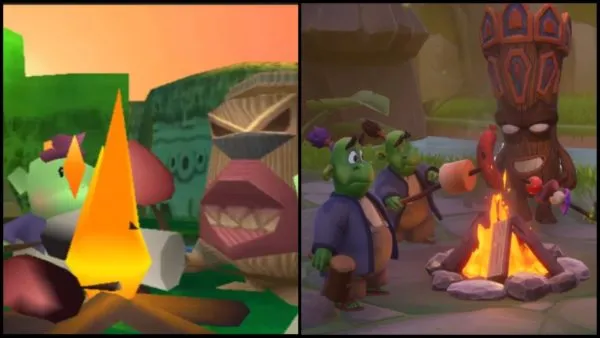
In Ripto’s Rage the series started introducing more cutscenes, with each level having an intro and an outro cutscene. Going back and watching these scenes now they sure seem primitive, while the Reignited Trilogy could very well just be sequences cut from a Spyro cartoon.
Particularly, the image above is from an early level called Idol Springs in Ripto’s rage. As you can see, the general design of the tiki enemies has been totally changed, although the other characters still somewhat resemble their original counterparts. Of course, it’s also the perfect example at how far video game fire has come.
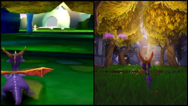
The other image is from the level Hurricos, and it perfectly shows off the level of foliage on display in the Reignited Trilogy. You can also see the dynamic lighting and particle effects in the newer one as well.
Spyro: Year of the Dragon
Spyro: Year of the Dragon has some of the series’ most imaginative and colorful locals, and the Reignited Trilogy only makes those places all the better. The image on the left is from the first hub world, Sunrise Spring, which is just teeming with wildlife and detail in the Reignited Trilogy. Particularly of note is the point where you go through this grove of trees, which has leaves billowing down from the trees and accompanied by some impressive effects in the remake.
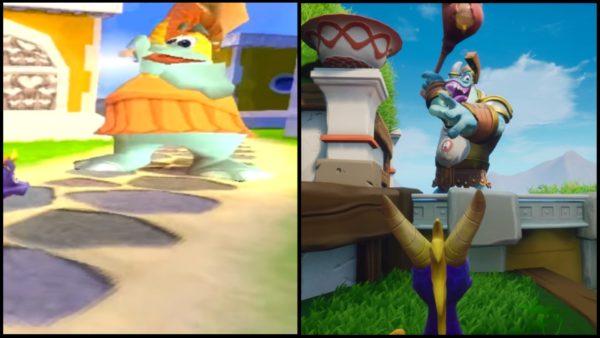
On the right is another example of a big overhaul in enemy design, with a Rhynoc from Sunny Villa. The enemy actually looks a little terrifying in the Reignited trilogy, versus the incredibly goofy version seen in the original. They still function the same, of course, but their look and animations are silky smooth in the remake.








Updated: Nov 13, 2018 10:41 am