Most older gamers who grew up with classics like Chrono Trigger and Final Fantasy have clamored for more nostalgic, traditional JRPGs at least once in our lives. Luckily, developers have delivered on more than one occasion. Unfortunately, many of the products released as a result of these requests don’t feature the same amount of retro charm many are actually looking for.
It’s one thing to offer a turn-based combat system or a satisfying narrative with a great payoff, but if the game doesn’t look the part, it’s not filling that specific niche the way we all want it to. With that said, Octopath Traveler’s unique and distinctive art style totally nails it. So, hey, Square Enix? If you’re listening, consider adopting the very same aesthetic for all the rest of your potential old-school JRPGs.
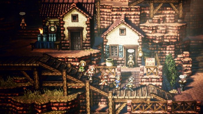
If you haven’t yet treated your eyes to the gorgeous display that is Octopath Traveler’s artwork, as you can see in the image above, it features a HD-2D art style, as pronounced by producer Masashi Takahashi. Originally, the team went to work on creating a look that would resonate with players who grew up with JRPGs that released during the 8-bit and 16-bit eras, but that incorporated high-definition and high quality assets as well. It doesn’t simply resort to the tried-and-true method of adopting pixelated sprites, as one might expect. The team could have queued up RPG Maker and called it a day, like we see with some traditional-leaning RPGs, but they decided to go in a different direction.
“We tried different things, and originally we did try to put everything in pixel-style art,” said producer Takahashi in an interview with Game Informer. “But at the end of the day, compared to what we were thinking of, it felt fake and low-quality.” It’s such a great thing that they did, too.
While the backgrounds feature high-res textures that look as though they wouldn’t be out of place in more modern games, the characters and sprites themselves have the quaint, classic look you’d expect to see in games like Terranigma or Live-A-Live. It can be jarring, seeing polygonal houses with 2D sprites traversing villages around them, but it’s also such a cool and unique look that we don’t see enough of. Combat looks even more distinct, taking place on a 3D battlefield that looks almost like something torn from a diorama.
Of course, the character promotional artwork is gorgeous and hand-drawn, illustrated in the same vein of classic JRPGs as well. They’re no Amano masterworks, but there was clearly a great deal of work that went into bringing each scene painstakingly to life, just like the in-game sequences. It all comes together to weave a brilliant-looking symphony of pixelated goodness that wouldn’t look out of place as an early JRPG, except for the obvious modern touches. Flatten it all, and you’d have something from the Super Nintendo days that folks try and sell for triple its value in glass cases at conventions.
It all comes together in such a unique way that this should ultimately be the way future remakes or nostalgia trip-centered adventures are manufactured in the future — or at the very least where they draw most of their aesthetic inspiration. Octopath Traveler may not be perfect (I haven’t played it beyond the prologue yet), but the art style sure is close to it.







Updated: Jul 11, 2018 02:57 pm