UI and Design is Period Appropriate

Kingdom Come: Deliverance is an RPG cut from a different cloth, one that does away with all the fantastical elements and opts for a decidedly realistic approach, trying to accurately emulate the time period it’s set in. Kingdom Come takes place in 1403 Bohemia, a region that encompasses the western area of the Czech Republic.
During a presentation and hands-on event at E3 2017, we got a look at just how the developer has made the title period appropriate, immersing players in a medieval fantasy. Warhorse has gone to painstaking lengths to make everything about Kingdom Come feel fitting to its setting, from the look of architecture right down to the UI itself. Objectives and notifications on your screen pop up on what looks like rolls of old parchment or banners, while opening the main menu brings up what appears to be an old tome emblazoned with different family crests and shields. When searching through the codex, character info pages are displayed with period artwork, instead of rendered character models.
During our look at the game at E3, PR manager Tobias Stolz-Zwilling and another Warhorse representative talked about their efforts to make the game look realistic. with everything from intricately rendered clothing to the landscape itself. “Vegetation that’s even in the Czech Republic, we’ve put into the game.” This, in particular, gives Kingdom Come a unique look, as its world is absolutely budding with green, rolling hills, looking like something you’d see in a King Arthur or Robin Hood movie.
Perhaps most impressive, however, is the world map, which looks exactly like a 15th-century painting of the landscape. Of course, it’s fully interactable with icons and everything, but it certainly helps add a unifying touch to the game’s aesthetic.
It’s clear that Warhorse wants you to feel like you’re in the middle of a medieval world, through both look and gameplay.
Real Historical Figures and Locations Will Appear

Warhorse doesn’t just want to appeal to realism with the look and feel of Kingdom Come, but also with the story and characters. The title is based on true history, and weaves its original story into real events. On top of that, some characters that are mentioned in the game and even some that appear, were actually alive during the time period the game takes place in.
For example, the game takes place after the death of Emperor Charles IV, which plunges the kingdom into chaos and corruption. You play as Henry, the son of a blacksmith, whose life is shattered when King Sigismund of Hungary orders a mercenary raid and burns your village to the ground. This forces you to join the resistance against Hungary’s invasion. Warhorse told us during E3, “Most NPCs in the game, well a lot of them, were actually there.”
Henry starts as just a minor player in the grand scheme of things, but your choices can make you a respected or feared figure of the time period. There aren’t a lot of games that play this intricately with actual history, and considering Kingdom Come’s dedication to realism, it’ll be interesting to see how the game implements its time period. Warhorse did say that the game will have a detailed codex in the menu, detailing various figures, historical events, and locations you’ll encounter. You can take a look at the most recent trailer for Kingdom Come, to get an idea of how the game’s story is set up.
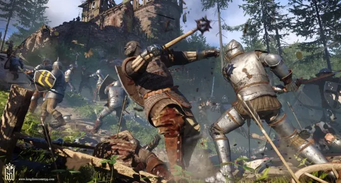
Combat Is Heavy and Reliant on Your Equipment

Combat in Kingdom Come: Deliverance may initially appear to be similar to something like The Elder Scrolls, but at its core, it’s functionally different. Battles can take upward of five minutes, as you square off with your enemy trying to get the advantage. Weapons and combat are heavy in Kingdom Come, your character moves deliberately, and each move counts. When you’re locked on to an enemy a six-point wheel appears, corresponding to different areas you can attack the enemy.
At this point, it becomes key to match where you’re attacking on the wheel, with how the enemy is blocking, or more specifically where they don’t have armor. Warhorse describes it as such, “How much damage I do is based on what kind of weapon I have, and what kind of armor he has. For example, if he has heavy armor on, you’re going to want to use a mace, because it’ll do more blunt damage. You can increase your fighting power, but it’s hard to become overpowered.”
Equipment is everything in Kingdom Come, and you’ll really need to consider your loadout before going into battle. You have 14 different slots for armor in the game, and you’ll need to make sure you have the right pieces in the right places. For example, putting plate armor directly on skin will put you at a huge disadvantage if someone attacks with a blunt weapon, as it’ll cause extreme damage with no protection. Because of this, you’ll need to put another piece of equipment on as a barrier. Of course, you’ll need to consider all of these same things for how you attack your enemies.
Another interesting feature we saw during the demo was when our character equipped a plate helmet. The slots and holes in the helmet blocked out your view, making it harder to see and coordinate your directional attacks in battle. At the same time, heavy plate armor significantly slows you down, whereas light armor gives you more speed and maneuverability. With just a short amount of time with the game, it wasn’t possible to tell if the combat will continue to deepen and prove engaging, or just manage to get more and more frustrating as you face stronger and more numerous enemies.
You Don’t Always Have to Be Chivalrous

The Medieval Ages were certainly not the pinnacle of chivalry, despite how popular media portrays the time period. However, Warhorse is adopting their focus on realism even to this aspect, letting players act however they want. Kingdom Come: Deliverance is a massive open world game, and Warhorse claims that choice will be a massive aspect of the title. If you want you can be the just knight seen in the movies, or you can be a murderous rogue only out for self gain. There were certainly all kinds of people in the Medieval Ages, and that rings true in Kingdom Come. Because of this, you have variation in the ways you approach situations, building renown while you do so. Your choices will decide whether you’re known as kind and forgiving, or ruthless and feared.
One of the more interesting aspects Warhorse told us about was the fact that you can actually surrender in combat if you find yourself over your head. Enemies can also do the same thing, showing that Kingdom Come isn’t concerned about knightly chivalry, but more about survival. This idea ties into the dialogue system of the game as well, where you can choose to do things like persuade, intimidate, or seduce. Many of the big battles or skirmishes can be entirely avoided in the game by using your charisma, or you can just decide to smash some heads of course.
People Won’t Trust You Until You Get to Know Them

Kingdom Come: Deliverance uses a similar conversation system to other RPGs with multiple options on how you want to approach characters, or questions you want to ask them. But there is a key difference, NPCs won’t trust you until you get to know them, which can result in easier conversation options and new quests. Each character has a set of conversation skills that’ll get revealed as you talk to them more. Talking about the system, Warhorse said “The more you talk to certain people, you’re actually going to be able to see some of their skills. You’re not just going to know all about someone by talking to them the first time, so we try to give you a more realistic approach to immerse you in the game.”
Characters in the world of Kingdom Come also have their own agendas and tasks to complete. This can even come down to some NPCs giving you a quest opportunity, and then going to complete what they want your help with, whether you accept or not. The Medieval Ages were violent times, and people would have no reason to trust an outsider that walks into town, or even offer them help. Once again, it’s too early to say if this system will prove to feel worthwhile and realistic, but it certainly shows potential.
Kingdom Come: Deliverance is currently scheduled to release on February 18, 2018 for PS4, Xbox One, and PC. For more on the title and E3 2017, make sure to check back in with Twinfinite.


Updated: Jun 14, 2017 02:28 pm