Assassin’s Creed 2

Assassin’s Creed 2 starts the list off with its sleek, informative HUD. All of the Assassin’s Creed games have nicely designed HUDs but Assassin’s Creed 2 has the one with everything you need.
The health bar, weapon selection, map, and key buttons are easily visible and they remain on the screen so you’ll never forget crucial information about Ezio or what’s going on around you.
The HUD’s color scheme also makes all the info appear nicely on-screen. It’s also a good nod to the Animus given that the gameplay elements related to the simulation tend to be white or grey.
Assassin’s Creed 2 is, overall, an incredibly great game and it seems unsurprising for it to have a great HUD as well.
Persona 5

Persona 5 has a HUD that fits the game’s over-the-top style and general uniqueness. It reflects the slight cartoon-y aspect of the game while also being informative and concise.
It’s stylized, colorful, and an overall refreshing change to traditional HUDs. Character information like player health is neatly displayed in the corner while gameplay actions on-screen mirror button layouts for players to easily find.
Persona 5 doesn’t shy away from its colorful visual style and this is reflected in its HUD design, making an overlay that is both oddly immersive and very in your face.
Dead Space

Not all HUDs need to have words and numbers on the screen. Dead Space chooses a more minimal approach to its HUD design by displaying health and ammo more on Isaac Clarke’s body than on an overlay.
It definitely adds to the immersion, making the player focus more on their surroundings and on enemies with very little visually bulking up the screen with a HUD.
There is still information on screen for players but Dead Space focuses more on the essentials instead of extra details. It turns the game into a kind of interactive movie that’s too spooky for me.
The Dead Space series continues this design with the rest of its games. Minimalism in the right situations really makes a good experience.
Mirror’s Edge

Mirror’s Edge takes minimalism to the extreme with practically having no information on-screen. All you have are Faith’s hands, a tiny dot in the center of the screen, and the environment you run through.
Mirror’s Edge, in general, is a very minimalist game and it chooses to incorporate this minimalism in its HUD in the same way Dead Space does by turning the game into an immersive experience.
There is nothing on screen to distract you as you run and jump across rooftops and buildings. You even have the option to turn red objects off for an even more realistic experience.
The game easily turns into Parkour Simulator in the best way possible.
Bloodborne

Bloodborne has a very sleekly designed HUD that reflects the game’s overall Gothic and dark tone. It doesn’t feel out of place at all and it looks like a HUD you would expect out of Bloodborne.
The Soulsborne series tends to stick to the same HUD throughout its games and there’s a reason for it. You’ve got all you need on the screen fitted in a way that isn’t bulky or distracting.
In a game where everything is out to kill you and everything is incredibly dangerous having a HUD that doesn’t add any more negative aspects to your gaming experience is a blessing.
Especially since Bloodborne is a difficult game that has enemies that give you heart palpitations.
Doom (2016)

The most recent Doom moves away for the bulky O.G. Doom HUD by having a more modern and polished one that works well with the game’s setting and design.
It’s minimal in a way that doesn’t sacrifice information and its color scheme contrasts the red tones of the game’s general background.
Since a lot happens on screen in this game, having a HUD that doesn’t take up your view makes the immersion and gaming experience a lot easier on the eyes.
From what we’ve seen of Doom Eternal, it will also seem to be sticking with this style of HUD to keep with the modern Doom’s style.
The Surge

The Surge has a sleek HUD akin to Bloodborne’s. Instead of dark tones and Gothic elements, The Surge capitalizes on its Sci-Fi genre by providing a more futuristic HUD.
It fits into the lore of the game as well given that the player character has robotic augmentations and cybernetic additions to his body.
All the information you need is on-screen like your health, the enemy’s health, items, and scraps. Everything is compacted into sections that are easily understood.
The Surge 2 looks like it’ll continue using this particular HUD so we’ll surely be seeing it more sometime soon.
Fallout: New Vegas

Fallout: New Vegas, practically a classic at this point in time, favors the lower half of the screen for all of its HUD information. You can find enemy health, your health, the map compass, and your AP all at the bottom.
The HUD’s default color scheme also reflects the game’s overall warmer tone fitting especially with the fact that you’re in an incredibly hot desert.
When in V.A.T.S., enemies and objects are outlined for easy identification and shot percentages are just as visible on the enemy’s body.
Overall, regardless of how redundant this sounds, this is a very visual HUD that accents the game’s gameplay aspects well.
Horizon Zero Dawn

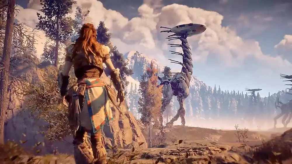
Horizon Zero Dawn uses a more minimal HUD that doesn’t take up much of the screen. This fits in well with the game’s overall open world scenery, allowing players to enjoy its unique setting and locales.
Akin to New Vegas, Horizon Zero Dawn also has a HUD aspect that highlights and outlines enemies in addition to providing more information in this way.
Its futuristic and “not in this time” feel fits in with the game’s lore by reminding players that the device that provides this information doesn’t belong in the world Aloy particularly lives in.
Horizon Zero Dawn is a wonderful game and its HUD really does add to its unique gaming experience.
Halo 3: ODST

All of the HUDs within the Halo games tend to be similar but ODST’s, in particular, adds a little more to the immersion and gameplay experience.
The HUD is more or less shaped in a way that’s similar to the helmet the titular ODST wear and the HUD’s color contrasts the typically dark tones of the game’s setting.
The night vision aspect, in particular, also adds a unique spin to your Halo experience by highlighting and outlining your surroundings in specific colors.
The slight difference in HUD in this game also reflects the fact that, in this game, you’re not an incredibly powerful Spartan warrior. Instead, you’re an elite soldier who is still very much a regular human.


Updated: Sep 19, 2019 01:13 pm