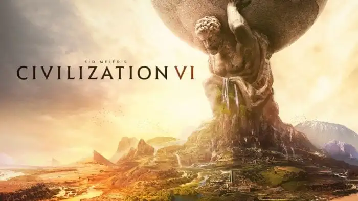
After the realistic look of the previous game, more than a few fans were confused by the change in art style for Civilization VI. Explaining the decision behind the move however, it turns out Firaxis saw the opportunity to do something new with the series and took it.
The new art style is not meant to be ‘cartoony,’ instead it is meant to evoke the Age of Exploration and old cartography maps, while being vibrant and bright. “With the Age of Exploration theme, we knew we were going to make the map more important with the game,” Lead Designer Ed Beach says.
“And what better way to bring that out than to have the art style reflect it. Because the coolest maps in the world are all those early maps where there were sea dragons on the edge of it. As soon as we hit on that theme for the art style, we said ‘Why did it take us six Civilizations to come up with that?’”
Beyond this though, Firaxis is still striving for a sense of realism in that exaggerated style. “We want to create a world that is living and realistic, and changing the time of day is one of the best way to do that,” Art Director Brian Busatti explains. It is the same thought process behind districts and wonders showing damage from battles, and many of the things in the environment having multiple building-stages.
Civilization VI releases Oct 21. This is only the most recent entry in the game’s ‘First Look’ series. Make sure to also check out the changes coming to cities and the recent reveals of Egypt and England. And if that’s not enough for you, there is also the full E3 demo, narrated by Sean Bean.
More News:
- 10 Pieces of Overwatch Ana Fan Art That’ll Make You Love Sniper Mom
- Mayor of Rio de Janeiro Wants Pokémon GO Released in Brazil Before Summer Olympics
- Nintendo to Release Mini NES This November
- Unlocking Hearthstone’s New Shaman Hero Requires You to Recruit a Friend


Published: Jul 14, 2016 12:55 pm