It’s that time of the year; as temperatures drop, Activision brings warmth to your home with another Call of Duty game. For the past 15 years, Call of Duty has been one of life’s most consistent guarantees as three studios put together the latest instalment in the long-standing military shooter. This year sees the franchise return to the present after a disappointing year in World War 2 with Call of Duty: Vanguard.
In case you missed it, CoD: Modern Warfare 2 is off to a roaring start. After launching its campaign portion in early access on Oct. 20, the rest of it was released on Oct. 28, with fans scrambling to power through the game’s multiplayer and Spec-Ops portions. Within just a few days, this entry has gone on to rack up $800 million in sales, making it the fastest-selling CoD title of all time, which ironically feels like a headline we see every year. It has been reported that more players have been online this past opening weekend than ever before, but how they managed to play the game is beyond me, as the latest entry boasts an abomination of a user interface system.
Let me be clear; I’ve been around the block as an active CoD player since 2008. I’ve seen how the franchise has progressed, I’ve experienced the highs and the lows, and I’ve seen what’s worked and what hasn’t worked across three different studios and 15 years of gaming. In my review of the latest entry, I thought Modern Warfare 2 was a solid outing that got held back by aspirations of doing big things and falling flat on those aspirations. Infinity Ward has taken what was relatively simple to understand and convoluted it for the sake of making a change to claim things have been changed. One of the most glaring issues is the one that smacks you right in the face when you launch the game, and it’s the horrid user interface.
Starting Up Modern Warfare 2
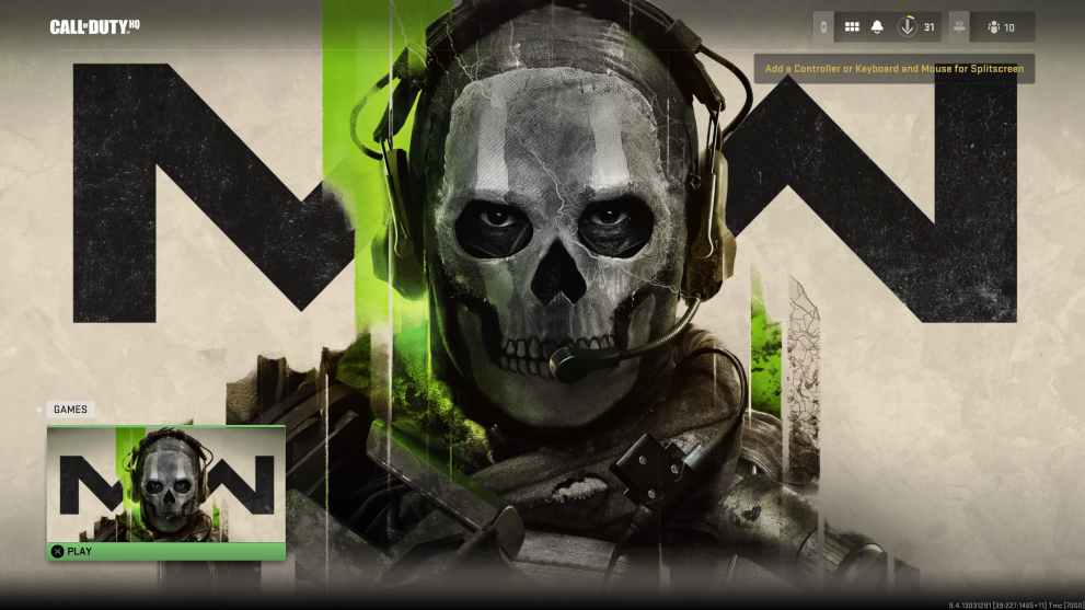
Let’s start from the beginning, the game’s start-up menu. As with any title, starting up MW2 will prompt you with pressing a button to get started. After that, you’re treated to a rather menacing shot of the series protagonist, Ghost, which then has you press another button to enter the game. From the get-go, it seems pretty straightforward and not that big of a deal, until you notice the absurd amount of free space on the Ghost screen.
Exiting the Ghost menu will bring you to an oddly familiar approach to a CoD menu. In what appears to be a Netflix-style menu, all of the game’s various modes are located here. This menu is broken up into four rows, highlighting certain portions of the game, such as the campaign, Spec-Ops missions, multiplayer game mode highlights, and more. This isn’t a problem until you go back to the Ghost menu and realize how much space could’ve been used to avoid the current Quickplay menu phenomenon.
There are many ways this secondary menu could’ve been broken up, but ironically, 2009’s Modern Warfare 2 is the shining example I immediately thought of for a solution. Take a look at the two images below with the image above, and you’ll see a noticeable difference in the menu quality.
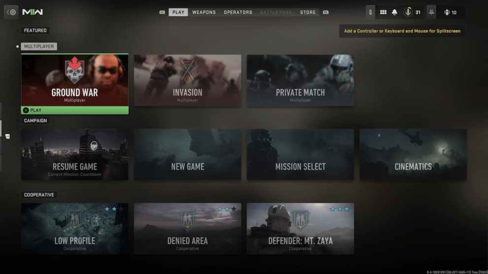
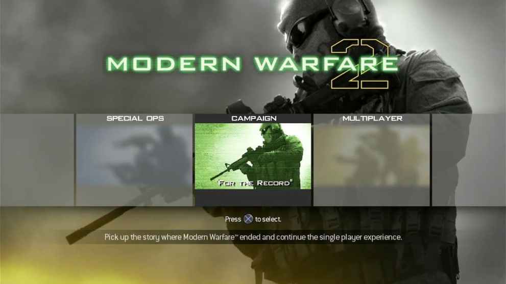
Mind you, the horizontal menu only serves to expedite your online exploration, as clicking on Campaign opens up a separate menu. What I imagine is going to happen is that when Warzone 2.0 launches later this month, the Ghost menu will get expanded to include Warzone and any future modes, such as the DMZ that’s supposed to come later. However, a simple solution would’ve been to copy the format from 2009’s Modern Warfare 2 and assemble it in the same vein, thus reducing how much time I spend slamming the continue button.
Modern Warfare 2’s Multiplayer Field Day
By now, you’ve spent enough time breaking into Fort Knox, and the real fun begins. MW2’s multiplayer features plenty of new features that allow you to customize your character and play style to your liking. However, it’s just as poorly assembled as the menus you navigated to get to this point. Let’s start with the most iconic CoD feature, your loadout.
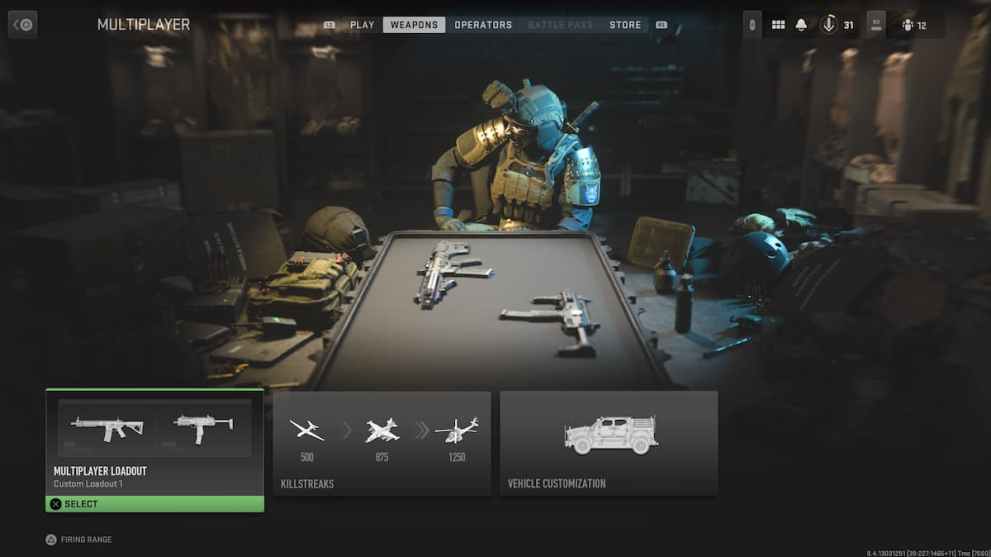
From the main menu, heading to the Weapons tab will bring you to your customization options. Clicking on the first tab will let you customize your weapons, equipment, and perks, but we’ll start with the Gunsmith. The Gunsmith system was introduced in 2019’s Modern Warfare, and it was overwhelming to understand. One gun could have over 30 attachments, and while it’s a neat nod to realism, it’s a daunting task for casual players to overcome. This time around it’s even harder to understand.
Modern Warfare 2 features a new Gunsmith platform that allows certain weapons to share attachments, as you can create certain weapons from one base model. For example, the M4 assault rifle has a family tree of four weapons that you unlock using various weapons in-game. This new, integrated system was created to help reduce the weapon grind introduced with addition of thousands of unique attachments. Side note aside, this new system is subject to a series of menus that’ll have you wanting to return the game. For the sake of consistency, I’ll use the M4 as the primary example to discuss this system’s flaws.
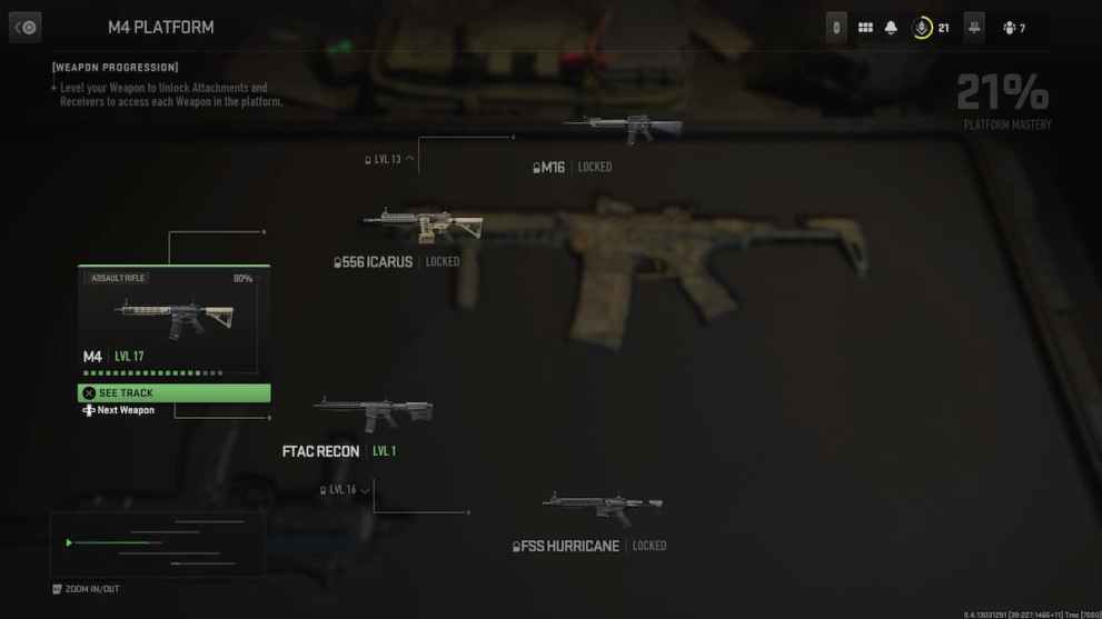
Clicking on the M4 will give you the option to swap out the weapon for a different gun or present you with the Gunsmith to customize your weapon choice. Clicking on any of the slots will show you plenty of locked attachments, with the requirement saying “Unlock by leveling up X weapon to X level”. That’s all fine and dandy until you realize you don’t know which class said weapon belongs to, and you have to sift through the weapon classes to discover where that weapon belongs to, only to then discover it’s locked in a cruel case of “go here, go there”.
This issue grows in size by something that bothers me quite a bit. As mentioned, the M4 unlocks four other weapons, and said weapons take up space in the weapon categories. This is rather irksome because it’s eerily reminiscent of the days when fighter games claimed they had over 150 characters, just for you to discover that 50 of them are just powered-up versions of said character. In anime terms, Dragon Ball Z legend Goku, and his five other powered-up modes would make up a significant chunk of a playable roster.
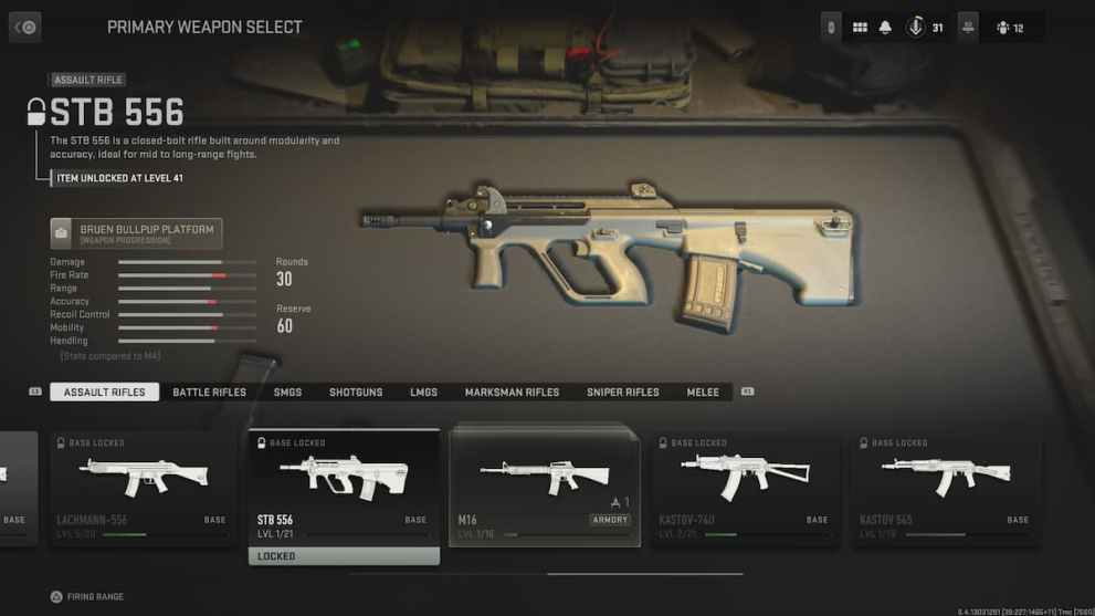
A simple way to clean this up would’ve been to stack the weapon unlocks behind the primary weapon unlock in a manner like in the above image. If the M4 unlocks the M16, stack them behind each other instead of clogging up the weapon class with locked icons. Going off of that, let us save our custom blueprints that allowed for our creative tinkering instead of making players sift through menus upon menus. Coincidentally, the ability to save blueprints is absent in the full build of MW2.
The other issue I have, and this might seem minor, is the fact that nothing in any of the menus is organized in any particular order. Weapons are shoddily organized in a free-for-all manner, with guns at the end of their classes unlocking at level 10, and perks are organized in the same confusing manner. There’s not a single sense of organization, and it’s baffling as you normally would assume weapons/perks at the end are stronger and require higher levels to unlock. Not here though.
Modern Warfare 2 Doesn’t Want You to Play with Friends
Finally, the game’s social systems are a bit sloppy as well. The problem with the social systems, much like the previous areas of the UI, is there’s way too many menus to get lost in.
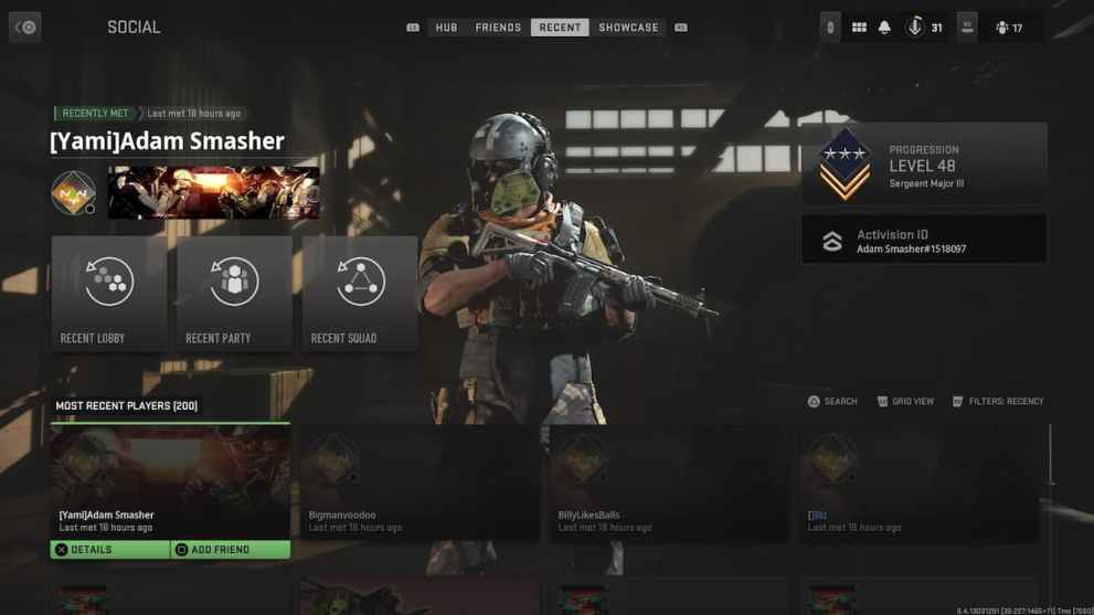
Heading to the Social area will open up another bevy of options titled Hub, Friends, Recent, and Showcase. Again, this normally wouldn’t be an issue, yet Hub and Friends show the exact same information, so those two should’ve been combined into one menu. Not to mention, there’s a separate menu for in-game party chat which, again, could’ve been combined into one menu with the two previous systems. Don’t even ask me about customizing social icons because there’s a whole Mortal Kombat finisher you have to enter, which breaks my will to even want to customize anything.
I want to conclude this with an observation I’ve made. When MW2 launched, it became apparent that key components were missing in action. These range from camo notifications to challenge and progression information being readily available. The problem with MW2’s user interface, aside from being a big sea of screens, is that this UI feels like an attempt to cover up said missing features. If I bury my secrets so far down behind a sea of menus, you’re less likely to care and notice they’re missing. Mission failed, we love reading menus.
If this entire post came off as overly complex and complicated to follow, then it serves as a perfect representation of my experience in Menu Warfare 2. Why reinvent the wheel to become a square? MW2’s user interface is the prime example of more is less, and the sad part is I don’t expect any changes to come anytime soon, let alone a complete overhaul. Infinity Ward sticks with what Infinity Ward knows, and it’s doubling down on questionable design choices to things that didn’t need change.
