Valorant’s passionate community is often quick to snap at Riot Games when it comes to weapon skins. Players hungry for cool designs to justify their (admittedly steep) price tag push the development teams to innovate bolder and more interesting concepts. Sometimes, though, that challenge sees skin appearances edge close to jeopardizing the competitive integrity at the core of the Valorant experience.
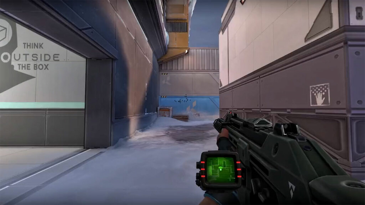
It’s never crossed that line, of course, but when I spoke with Riot Games VFX Artist Nicolas Ceriani in a recent interview, I wanted to get an idea of what extent the team goes to consider the tactical implications of their designs. Notably, Ceriani was involved in the development of the Xenohunter skin bundle, which was scrutinized by the Valorant community for featuring a radar screen that displayed the in-game map. It wasn’t so much the map itself that was the problem but the reduced peripheral vision and its large size caused those who upgraded the skin to feature it.
When I quizzed Ceriani about the development process behind that particular design, here’s what he told me:
“Competitive integrity is one of the key aspects we never lose sight of when making new content, so these kinds of questions come up constantly. We have playtest sessions every week fully dedicated to testing new skins. This is obviously where we hunt for bugs, but also get a feel for these trickier situations where a weapon has something that could work in or against your favor. We specify these important testing points prior to the session so that the testers know what to specifically pay attention to. Then it’s a matter of balance, we just need to play with the right levers. Is the screen too distracting? We can resize it, move it, and reduce the VFX intensity. Is the Neptune aquarium too see-through? Just slightly raise that water opacity, and we’re done.
Sometimes it does require a bit more work, like that Xenohunter screen. In this example we felt it might give a competitive advantage to have the map closer when navigating through smoke, which is supposed to be slightly disorienting, so we chose to go the extra mile by distorting it when entering them. No matter what, we’re always doing our best to thoroughly inspect each detail, each animation frame, and each shape to make sure nothing slips past.“
Look out for more snippets from our interview with Nicolas Ceriani throughout this week ahead of its publication in full. You can check out the latest on everything Valorant right on Twinfinite, including our breakdown of the crypto-throwing ranked saga that’s seen Pro City 10-Mans take over North America’s highest elo.



Updated: Feb 1, 2023 10:43 am