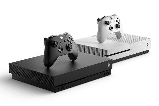
OG Xbox

The original Xbox launched in 2001 and marked Microsoft’s foray into the console market. The console’s UI featured a smattering of Xbox’s iconic green hues and basic navigation to memory management, music, and general setting. More than the UI’s green onslaught, the original Xbox’s dashboard is, perhaps, even better known for its sci-fi inspired navigation sounds. The unique sound effects gave the menus a futuristic feel, but if the console was left idle long enough, player’s were met with an eerie whisper. Turns out, the terrifying noises were actually modified recordings of the Apollo missions, according to Xbox Director of Programming, Larry Hryb.
After its release, the UI remained fairly unchanged besides the addition of an Xbox Live tab when the service launched in 2002. From that menu, gamers could add friends, set up voice chat for up to 16 people, and see what friends were up to online.
The original Xbox UI was basic but functional. More importantly, it laid the groundwork for what would become a far more complex ecosystem in the 360 generation.
Xbox 360 Blades

No Xbox dashboard has garnered a rabid fanbase quite like the Xbox 360 blades dashboard. Despite the initial hardware issues that plagued the 360s launch, people have an overwhelmingly positive memory of the console’s original dashboard. Originally featuring four tabs (later expanded to five to include the Marketplace), the blades dashboard was responsive and easy to navigate. A miniaturized guide popped up from the side allowing users to utilize menu functions without having to completely exit their game.
Much like the OG Xbox’s dashboard, the blades were known as much for their iconic sounds as it was for its unusual aesthetic. The swish/swoosh that went up and down in pitch as the user navigated between menus is possibly the most recognizable sound in all of UI sound design.
In a Reddit thread posted a year ago, Hryb told a story from the 2016 New Xbox One Experience announcement. “At E3 this year,” Hyrb wrote, “right before we were set to announce NXOE, a few of us were guessing how long it was going to take for the ‘Can we have the blades back’ threads to appear online. It took about 2 minutes.”
When asked by a user if Xbox users could get the blades back, Hryb simply replied, “no.”
Xbox 360 NXE

In 2008, Xbox transitioned away from the blade design that had become so popular at the 360’s launch and introduced what they referred to as the “New Xbox Experience (NXE)” — a moniker that would return during the Xbox One era. While the blades were criticized for being too text heavy, the NXE failed to show enough information at any given time. A scrolling vertical menu replaced the iconic blades, and over half of the screen was lost to unused space in the UI.
The NXE did introduce avatars, though. These highly customizable characters allowed players to perfectly craft their digital likeness from face and body structure to game specific t-shirts and crazy outfits. Some arcade games supported these avatars as characters within the game (Anyone remember 1 vs. 100), and they would appear next to friends when they were online.
This update also introduced a couple features that are still in use today. The NXE allowed users to customize their background as well as friend sorting to make finding friends to play with much easier.
Xbox 360 Metro

The last major UI overhaul for 360 was the Metro redesign, released in 2011. In lieu of the vertical scrolling menu, the interface returned to the horizontal, always-in-view menu that made the blade design so easy to navigate. But rather than returning to the text-heavy design of the console’s original dashboard, the metro design introduced tiles to keep in step with the Windows 8 design. It also allowed users to save files via the cloud.
In many ways, the metro design served as Microsoft’s first step into having a console that served as much as a media suite as it did a console. The console now featured a robust array of non-gaming applications such as Netflix, ESPN 360, and other streaming services, and the Metro design allowed for easy navigation between all of these different apps.
Microsoft commissioned sound designer Andrew Rohrmann aka scntfc, the composer behind the beautiful Oxenfree soundtrack, to develop all of the UI sound effects. Rohrmann drew a lot of inspiration from the original blade design’s sounds. The swish/swoosh returned when navigating between submenus.
Original Xbox One Dashboard

The original Xbox One dashboard bore a lot of resemblance to the Metro design of the Xbox 360 with its Windows 8-esque tile structure. It featured a snap system that allowed two apps to run side-by-side so that users could play a game on the larger portion of the screen and watch Monday Night Football in a smaller section in the top right corner. What was supposed to be a unique accessibility feature that allowed users to pop back and forth between apps, actually slowed the system to a crawl. In fact, the entire interface was rather clunky and unresponsive.
Built around the Xbox One experience which included the Kinect, the original dashboard tried to make use of large tiles for gesture navigating and voice commands that allowed the user to control the volume on the TV, the channel they were watching, and even powering the system on and off (How many times did you have to say Xbox On?).
This UI design only lasted a little over a year before Microsoft replaced it with a new, more responsive design.
New Xbox One Experience

Much like the second iteration of the Xbox 360 UI, the replacement dashboard for the original Xbox One’s was called the New Xbox One Experience. Doing away with the tile design that had become a staple across all Windows platforms, the NXOE focused on speed and responsiveness as the company shifted away from the more Kinect-focused vision they originally had for the Xbox One.
The NXOE made use of both a horizontal menu on top to navigate through submenus, and a sidebar menu that allowed users to quickly access social and settings menus. The guide button now opened up this side menu, rather than kicking the player all the way back to the home screen. From there they could join a party, invite friends to a game, view and reply to messages, and change settings.
Latest Xbox One UI

The latest Xbox One UI update has yet to leave the Xbox Insiders program, but it represents the third major UI overhaul in under four years for the console. The home screen itself takes on a new sleeker look, though some have levied a complaint about all of the unused space.
The redesign, however, allows users to more quickly access their pins on the home screen to select the games and apps that they use the most. Not only will users be able to pin games to their home screen, they can also pin their favorite friends to allow for quicker navigation to party and game invites.
The guide will also undergo a major renovation when the interface launches later this year. Much like the old blade menu, the guide will now allow users to snap between menus using the bumpers, making navigation much quicker. But again, the most important aspect of the new update is speed. The UI is simply a tool to get in and out of games and apps as quickly and as easily as possible, and the new Xbox One dashboard is by far the fastest the console has seen.


Updated: Aug 21, 2017 01:35 pm