
UI Changes
Something all Final Fantasy fans remember are the stark blue menus in many of the classic Final Fantasy titles. When we were first shown the game back in 2015, we did get a couple of glimpses at the combat and the UI elements looked closer to Final Fantasy XV than Final Fantasy VII.
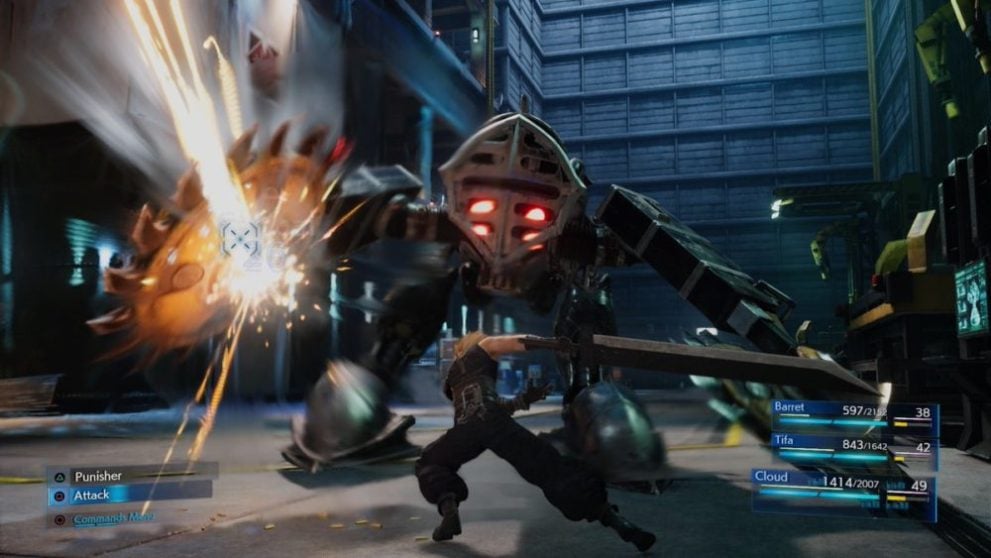
This seems to have been changed in the latest build of the game.
From the screenshot above you can see that now UI elements have a more blueish tint to them to reflect that classic look, also with bigger bounding boxes for better visibility.
Also, the text font has been changed to make things a bit more readable while trying to mimic the font from the original; if you look back at the old trailer you can see why they decided to change it.
UI and presentation can really help make a game feel right. There’s nothing worse than playing a good game with a lackluster presentation. Not that Final Fantasy VII Remake ever had that problem, but now it’s more faithful to the source material.