A Seamless Menu UI
Overall, God of War UI system is alright. There’s nothing too clunky or huge on the screen when you’re cruising around Midgard or yeeting your axe at a poor skeleton somewhere across the map.
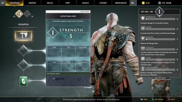
However, the actual menu system found on the pause screen which includes the weapon and armor customization, equipment screens, and Kratos’ and Atreus’ loadouts has a bit too much going on.
I mentioned previously that some of the upgrades and customization felt meaningless combat-wise but the actual screens are bloated with a lot of information, elements, and tiny text.
Condensing and streamlining customization and the layout of the pause menu in its sequel would be a quality of life improvement that’d take a little of the stress out of the UI.
Also, enlarging the text would be fantastic because before they fixed it in God of War, you essentially needed a magnifying glass to read anything.