steamworld dig 2

5 Ugliest Nintendo Switch Icons that Make Us Wanna Delete the Game

Video games shouldn't be judged based upon their icon.

Kingdom: New Lands

Recommended Videos

kingdom new lands

This may be the worst Switch icon. It looks like a mobile app, features a terrible color palette, forgets to include the name of the game, and does NOTHING to convey what the game is actually about. This icon is just ugly, and it’s the reason why Kingdom: New Lands is no longer on my Switch. I’ve only got 12 tiles on the home page. Either look pretty or don’t get played.


Twinfinite is supported by our audience. When you purchase through links on our site, we may earn a small affiliate commission. Learn more
related content
Read Article The Alters Hands-On Preview – A Pleasant Surprise
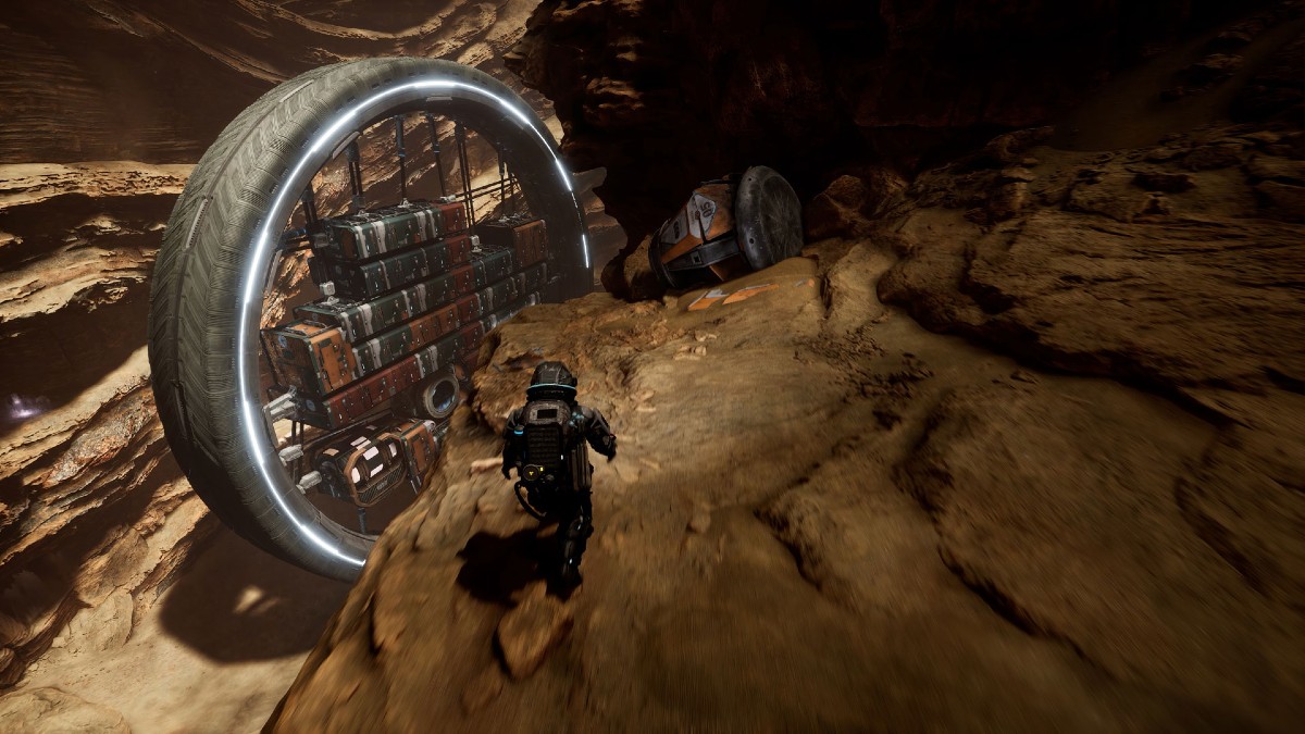
Jan Dolski running towards his spaceship in The Alters.
Read Article EA FC 24: Best Teams
EA FC 24 File Size for PC & Consoles
Read Article Assassin’s Creed Shadows Trailer Breakdown: Setting, Gameplay, Characters, & Release Date
Related Content
Read Article The Alters Hands-On Preview – A Pleasant Surprise
Jan Dolski running towards his spaceship in The Alters.
Read Article EA FC 24: Best Teams
EA FC 24 File Size for PC & Consoles
Read Article Assassin’s Creed Shadows Trailer Breakdown: Setting, Gameplay, Characters, & Release Date
Author
Jordan Ramée
A geek by occupation, Jordan attends conventions solely to run into fellow makers, content creators, and artists. When he's not slacking off with a new video game, anime, or graphic novel, he's writing, video editing, or podcasting.