
After producing an excellent remaster of Final Fantasy X/X2, Virtuos Studio is back, helping to renovate an updated version of Final Fantasy XII with Square Enix. Titled The Zodiac Age, the PS4 exclusive adds a host of gameplay improvements, including the addition of a turbo mode, autosave feature, and the “job” system that was only previously available in the Japanese version.
The game has also been given a thorough visual overhaul to bring it as close as possible to modern standards. By way of upgraded high definition textures, post filters and massive improvements to lighting, The Zodiac Age is an absolutely stunning example of a remastered game. Perhaps, even, the new benchmark in HD remasters.
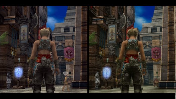
In this feature, we’re going to demonstrate just how notable those improvements are as we take a closer look at the results of Virtuos Studios excellent work. We’ve compiled nine images across three different shot types to show off the additional fidelity, lighting, and improved textures in this edition of the game. For reference, the original game is pictured on the left of each image, with the enhanced The Zodiac Age version on the right, and make sure to click on the images to bring up full size.
Close Up: Fidelity and Detail
Upscaling Final Fantasy XII to 1080p for the Zodiac edition has obviously made a tremendous difference to the clarity of what players can see up close. In combination with superior shading, the facial features of the above characters are far better articulated, breathing life into them with level of detail not possible in standard definition. The individual strands of hair are a notable improvement in these shots, as is the inclusion of bolder shading, which gives the characters a more three-dimensional appearance. Virtuos Studios has taken the time to color the textures with a deeper palette that, pictured next to the original, make the PS2 version appear washed out by comparison. Many games during the PS2 used a fairly muted color palette for a cinematic look; fine for low-resolution graphics, but in HD and pictured on LED television screens, a higher contrast of colors looks far more attractive.
Third Person: Texture and Anti-aliasing Improvements
Playing through Final Fantasy 12 once again, and especially when using the old PS2 screenshots as a reference, one really gets an appreciation for the exceptional level of detail that went into the game’s locations. For an eleven-year-old game, the meticulous effort that Square Enix spent adding small nuances to enhance immersion is impressive. The shots we’ve compiled here certainly showcase the gorgeous city of Rabanastre in crystal clear 1080p, articulated by better lighting and a sheen that really highlights its detail.
For The Zodiac Age, very few additions have actually been added, and the improvements are more about the extra clarity that higher definition has brought. Now those lovely details are actually visible: the individual leaves of foliage, the patterns on the walls of the city, the signage hung about Rabanstre.
The anti-aliasing and inclusion of mipmapping give everything a super clean look in The Zodiac Age, void of the jagged edges and shimmering of the original. And while the third person character models can’t possibly match lifelike movements of current generation hardware, the game’s art style holds up really well in higher resolution.
In Battle: Lighting and Effects
Battle sequences are where The Zodiac Age really shines in comparison to the original game. The PS4 version definitely uses the same texture assets of the original, but the filter that Virtuos have used does a great job of smoothing everything over and giving it a more modern sheen. In battle, lighting effects from spells and explosions look brilliant and the additional power of PS4 hardware has allowed the developers to include more over-the-top effects that wouldn’t run on PS2.
With respect to frame-rate: yes, the PS4 still runs at 30fps, which is identical to the original. But while the lack of 60fps is slightly disappointing, there’s a case to be made that the semi-turn-based combat doesn’t really require super low latency and high framerates to be enjoyed. The vividness of color, deeper palette, and sharper contrast mean that battle scenes look spectacular even in comparison to modern games.







Updated: Jul 11, 2017 11:43 am