Transport yourself back to the 1990s. It’s Friday night and the local Blockbuster is packed with people. You are scanning the shelves and box arts of the video game isle for something, anything, that you can take home and play for the weekend.
Finally, you come across a game that has amazing box art that catches your eye, and without ever seeing gameplay or reading a review, you find yourself greeted by the game’s title screen as you pop it into your console.
It isn’t long before you realize that you have been misled by the cover art and the game you rented is hot garbage.
You ask yourself, how is this possible? How can a video game adaptation of the ABC hit television series Home Improvement not be a perfect game?
This is the pain that many people of that generation suffered.
Similar to the cover of a book, box art can be an entry point for new experiences. However, also similar to a book, you should never judge one by its cover.
Here are 10 bad video games with some pretty amazing box art:
Kid Kool
Releasing back in 1988 for the Nintendo Entertainment System, Kid Kool was often compared to games like Mario due to both titles being platformers.
Unfortunately for Kid Kool, that is where the similarities end.
Developed by Vic Tokai, Kid Kool’s plot revolves around saving the King from a deathly illness by finding the Seven Wonder Herbs.
The game is plagued with horrid controls, translation errors and unforgiving enemies that make the game a test of the player’s sanity.
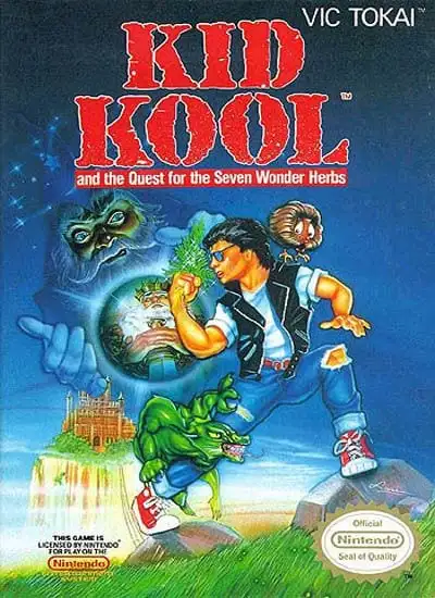
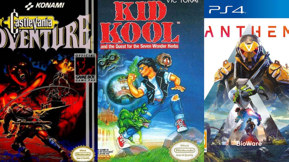
The box art, however, is a completely different story. The kid on the cover is definitely “kool”, sporting a leather vest and bright red converse sneakers while flexing at an evil wizard floating in the sky.
The longer you stare at the cover of Kid Kool, the more you will start to find. The artist understood their game extremely well and implemented as much information as they could into the cover, including hiding their signature in the rock that Kid Kool is perched upon.
This is truly a piece of art that continues to catch eyes to this day. If only Kid Kool was a “kool” video game, it may have missed our list of bad games with amazing box art.
Troll And I
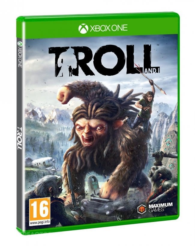
Currently sitting at a Metacritic score of 39, Troll and I makes a case to be one of the worst games of this generation. Its box art, on the other hand, remains alluring to unsuspecting players.
Troll and I is a narrative-focused action game that revolves around a Troll escaping hunters in Scandanavia. During his escape, the Troll encounters a little boy named Otto who becomes determined to save him.
The amazing box art depicts the story very well by showing the Troll smashing a vehicle while Otto rides on his back as the hunters in the foreground prepare for battle with the beast.
In a generation where most box art is just a generic military soldier with their back turned, Troll and I deserves acknowledgment for their thoughtful representation of their game on the cover.
Although the box art’s depiction of the story is endearing, the execution of the story in-game leaves a lot to be desired.
Bad storytelling coupled with sluggish controls and frame rates that make the game nearly unplayable on the Nintendo Switch puts Troll and I as one of the worst games on our list.
Bad Street Brawler
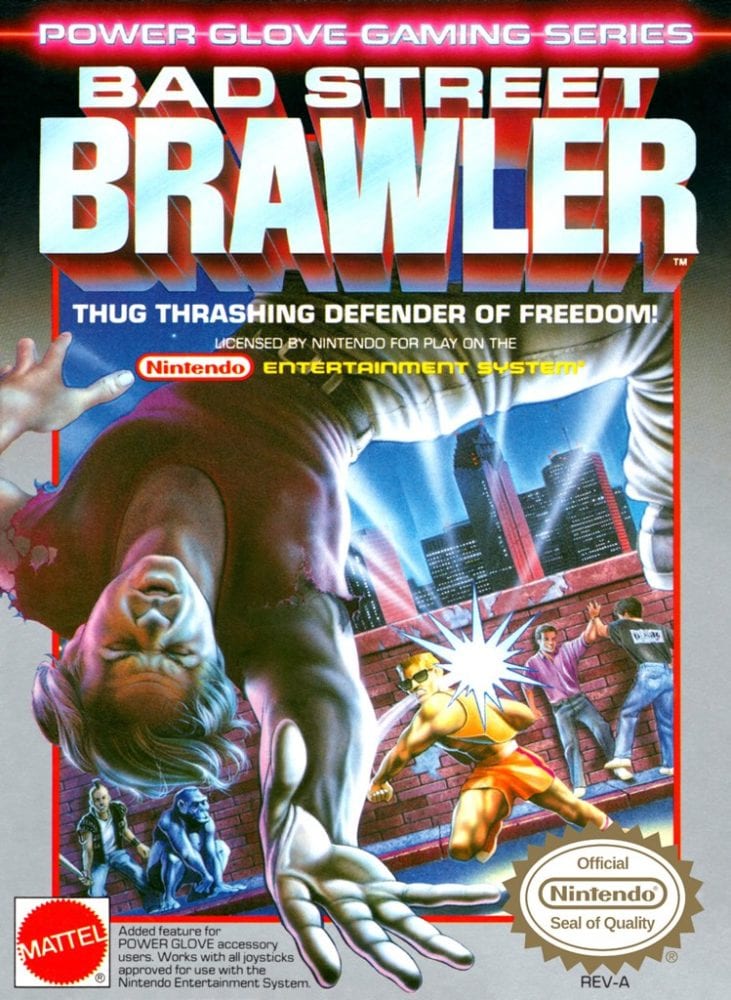
Punk rockers hanging out with monkeys? Two men high fiving with both hand and foot? A Val Kilmer look-a-like getting punched so hard it causes a lens flare?
It must be Bad Street Brawler.
Gracing the NES console in 1987, Bad Street Brawler is one of the two total games that were designed with the Power Glove in mind. Using a regular NES controller was possible, but yielded even worse results due to the game locking out certain moves that were only available with the Power Glove.
With a game this bad, it is hard to find much that appeals to an audience. That is where the amazing box art steps in.
Although Bad Street Brawler’s cover art looks like complete nonsense, it is quite representative of the actual game. With enemies such as evil punk rockers and monkeys that throw bananas, the cover is an authentic telling of what players are in for when they prepare to brawl in the streets.
Bad Street Brawler not only lives up to its amazing box art, but it unfortunately fully lives up to its name as well, with an emphasis on the bad.
Agony
Speaking of games that live up to their name, the true agony comes from how painfully lethargic and uninteresting this 2018 Kickstarter funded game is.
Agony is a first-person survival horror game that puts the player deep within the depths of hell. The developers embraced this theme so much that the game was initially marked to receive an Adults-Only rating until they toned down the satanic imagery.
Although some of the in-game visuals are impressive, the overabundant use of gore and blood makes the environments feel messy and distracting. The game often uses overly dark areas to hide textures and the game’s subtitles that are in a practically unreadable font.
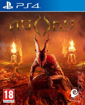
The box art for Agony is the only thing that is worth noting. The lava red cover with a devilish horned-demon in the center of the cover is an attracting offer for people who are looking for a grittier horror game.
Unless players want to experience true agony, it is best to keep Agony out of your collection of games.
Drakkhen
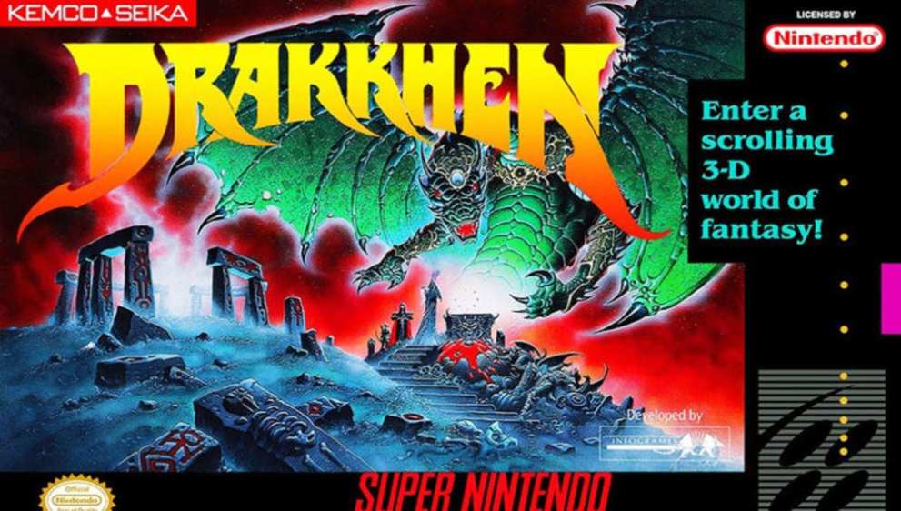
Drakkhen’s cover art is a masterpiece that would be a worthy fit for anyone’s bedroom wall, unfortunately for the actual game, it’s not even worthy of being near anyone’s Super Nintendo.
Everything about the cover is perfect. It has a wizard summoning a dragon that is wearing a jeweled crown all while looming over a red skied grave next to Stonehenge. What more is there to say?
However, for players that expect to see that same sort of imagery in the game are in for a rude awakening.
Drakkhen tries to mix far too many genres into one, leaving it to be a mess of mechanics that feel like a chore for the player to balance.
The mix of first-person views with third-person RPG battles and an inventory system taken from an adventure game on PC makes for a game that feels like it doesn’t know what it wants to be.
Although there are many places to play Drakkhen today, including Steam, it is probably best left as a poster on your wall rather than a game.
Super Pitfall
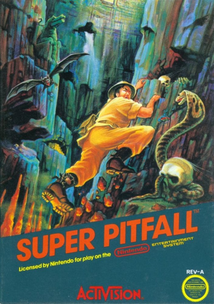
Much like Kid Kool, the longer you stare at the amazing box art for Super Pitfall, the more you will start to find.
There are skeletons hidden in every nook and cranny, an alligator statue blending into the mountainside, and with everything else going on in the picture, you may not have noticed the giant spider on Pitfall Harry’s leg.
Although the version of Super Pitfall on the Atari 2600 is praised, the NES version developed by Micronics remains one of the worst porting efforts on the console.
The game is filled with annoyances such as one-hit deaths, a lack of ammo, and ladders that lead to nothing but death. Micronics took what made Super Pitfall great elsewhere and threw it in the trash to create one of the most excruciating experiences in gaming.
Not only did this game receive negative reviews when it launched in 1986, but nearly 25 years later, the Angry Video Game Nerd posted his scathing review of the game, cementing it as one of the worst in the NES library.
Super Pitfall has an extremely engaging cover that calls out to those that want to live their dreams of becoming an adventurous spelunker.
Unfortunately, the game fails to live up to that dream and makes players feel like the only thing taking a Super Pitfall is their mental stability.
Anthem
Anthem continues to be one of the biggest critical flops of this console generation.
The Bioware looter shooter was set up to be a massive success until development woes and leadership changes at the studio caused the game to be re-designed multiple times before release.
Unfortunately for Bioware, the woes of Anthem continue. With a lack of updates, missed deadlines and no communication on what is next for the game, Anthem has been all but left to die.
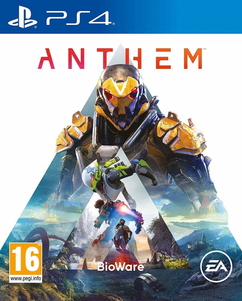
However, the one thing that Anthem can be praised for is its art direction, and that includes its box art. The cascading “A” shape that represents the title gets continually smaller in the center of the cover, each of them showcasing one of the four Javelins the player can choose from inside.
The gorgeous landscape of Anthem’s world is also on full display, showing off the wide vistas and sky-reaching mountains that players can explore as they jetpack around the world.
Anthem’s criticisms are well deserved and the negativity surrounding the game continues to grow. Without any communication from Bioware or EA and no update on the horizon, Anthem remains one of the biggest let-downs in gaming history.
Rambo: The Video Game
John Rambo makes his way to consoles yet again with one of the most disappointing retellings of a movie franchise in history.
The cleverly titled, Rambo: The Video Game, sends players through various scenes from the first three films in an on-rails experience using the PS Move controllers. How on earth could it go wrong?
Most people would think that an action-packed movie like Rambo would make a perfect setting for a video game, but unfortunately for Rambo: The Video Game, it bottomed out with a score of 23 on Metacritic, making it one of the lowest-rated games on our list.
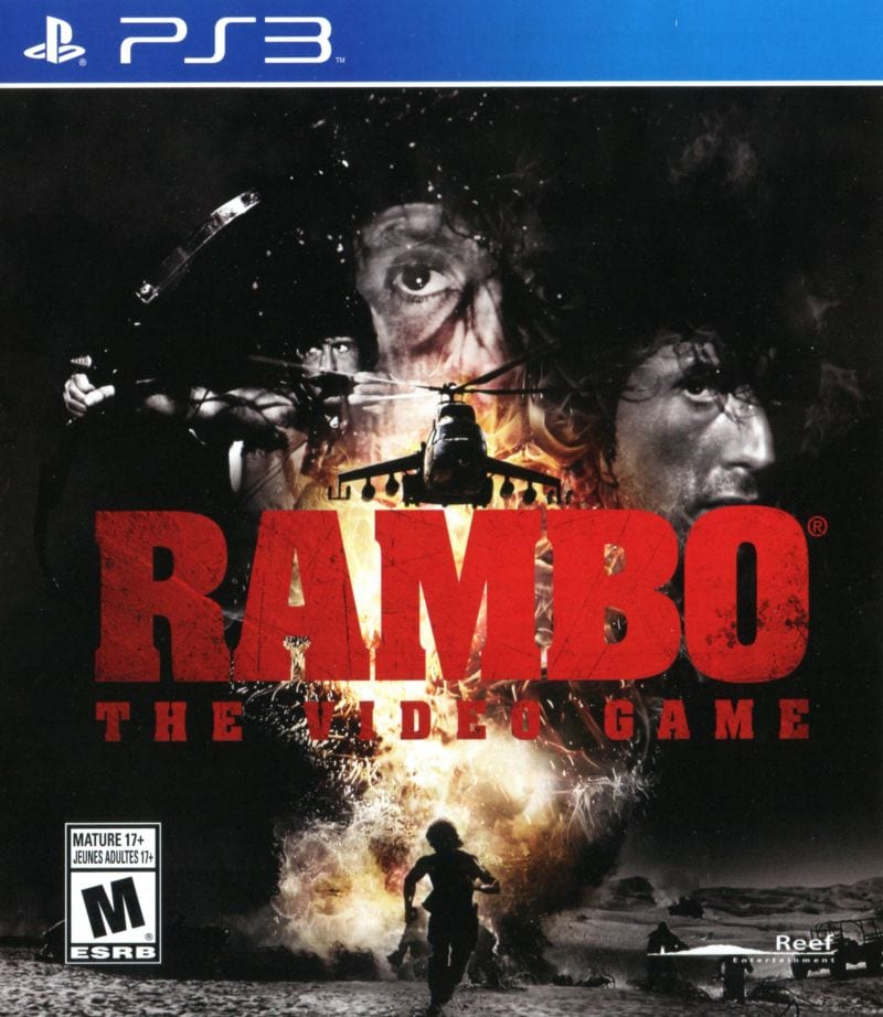
However, if just being a Rambo game didn’t entice players to check it out, the amazing box art might have done the trick.
Rambo is known for his guns blazing, bloodthirsty rage and that is on full display on the amazing box art. By implementing iconic shots from the films into the cover, it attracts both fans of the film franchise as well as gamers that are unfamiliar with the 80’s action star.
Using such an iconic cover makes the game stand out amongst the rest and tricks players into thinking they are getting an experience that is on par with the popular movie franchise, but when in reality, it’s probably better off left in the bargain bin.
What makes this game so awful is its forced on-rails movement and horrible implementation of audio. By using clips taken straight from the movie without any discernable editing, the voice acting and sound feels out of place and amateurish.
Combine that with outdated graphics and horrible gunplay and you quickly realize that Rambo: The Video Game is nothing more than a cash grab meant to target fans of the movie.
Although the Rambo movie franchise has had recent successes, Rambo: The Video Game has shared none of it and remains one of the worst video game adaptations of a movie in a very long time.
Castlevania: The Adventure
When the Gameboy released in 1989, third-party studios raced to get their flagship titles to the portable system.
Konami was no exception, as they rushed to put out a fully-fledged version of Castlevania on the console that very same year.
Enter Castlevania: The Adventure, one of the worst Castlevania games in the franchise. With unresponsive controls and massive slowdown, this game is a prime example of how developers rushing to be first to market on a new console can lead to disappointment.
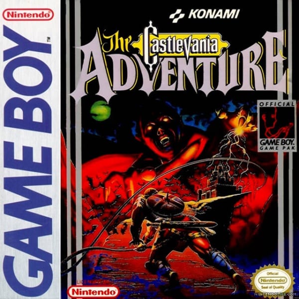
The box art, however, remains as one of the best in the Castlevania series. It does a fantastic job of capturing the haunting feeling players normally associate with the legacy of Castlevania.
As Dracula looms over his castle, Christopher Belmont remains steadfast in his journey to conquer it as his iconic whip cranks back to eliminate the onslaught of bats headed his way.
The artist’s use of colors is brilliantly balanced with the red hue of Dracula covering most of the cover while the bright green moon hangs in the background, almost as a sign of brighter times to come for the Belmonts as they once again take down the monsters that await inside.
Unfortunately for Konami, most players whipped this game out of their Gameboy as quickly as they put it in, leaving it to be one of the more forgettable Castlevania titles in the franchise’s history.
Resident Evil Outbreak File #2
Resident Evil Outbreak File #2 is the sequel to the Playstation 2 game Resident Evil Outbreak. However, what made the Outbreak games so different from their predecessors is their implementation of cooperative online play.
Resident Evil Outbreak was the first in the franchise’s long history that included online functionality.
However, considering that Resident Evil Outbreak File #2 is a sequel, gamers that purchased it were left feeling a little bit burned as Capcom failed to address key issues that plagued the first game.
While some of the mechanics Capcom added were well received, a lack of the ability to communicate freely in-game often caused players to abandon their teammates, and thus removing the appeal of cooperative play.
Although the game didn’t quite live up to its expectations, Resident Evil Outbreak File #2’s box art is still amazing to this day.
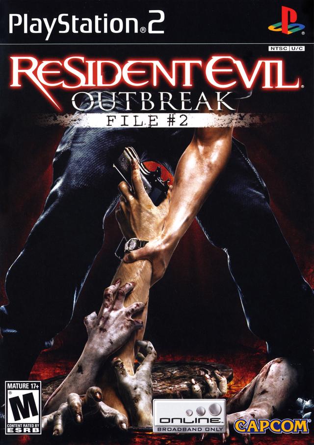
The cover art for the game perfectly encapsulates the desperation you feel in the game as the zombie hordes attack. The box art that Capcom created is timeless and would be an effective cover for any current or future generation title.
The cover perfectly represents the unique cooperative aspects of Outbreak File #2 by showing a player reaching out to another as they perish from the infected.
Unfortunately (or fortunately), players wanting to experience this game to its fullest are out of luck as Capcom shut down the servers only three years after the game’s launch.
Although these ten games are bad, their amazing box art reminds us all that we should never judge a game by its cover.







Updated: Jul 19, 2019 01:03 pm