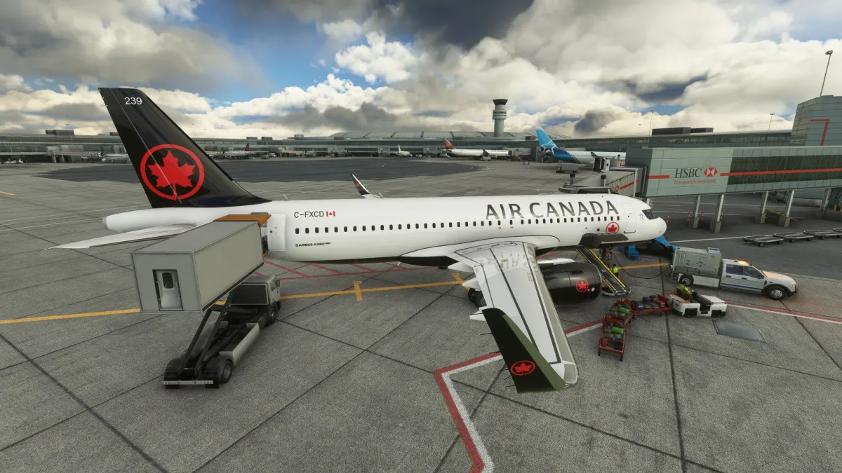
Acclaimed third-party scenery developer FlyTampa recently released Toronto Pearson Airport (CYYZ) for Microsoft Flight Simulator.
As the busiest airport in Canada and one of the busiest in North America, it’s certainly an important addition to the sim’s scenery line-up, catering mainly to airline, business, and cargo operations.
Toronto also benefits from photogrammetry in MSFS, meaning that you won’t need any further add-ons to enjoy some really scenic approaches and departures with the capital of Ontario and its lake in the background.
It’s available for $18.31 on Orbx Direct, which means that you can use the handy Orbx Central client to install and update the airport. FlyTampa usually releases its airports on Xbox after a while, so it should come to that platform as well.
If you’d like an extensive look at the scenery, you can watch an ILS approach and landing on runway 33R in the first video above, and a full flyover in a variety of lighting and weather conditions in the second video below. Do keep in mind that the scenery doesn’t have any static aircraft. The airliners you see are part of dynamic traffic from a couple of third-party solutions.
Speaking of that, the airport works spotlessly with AI traffic, with aircraft that won’t have any issue navigating from gates and ramps to any of the runways and vice-versa. Yet, it doesn’t appear to have specific airlines assigned to gates at the moment.
All the published SIDs and STARs work out of the box in accordance with the charts, so you’re all set for your instrumental approaches and departures.
On the other hand, all of the PAPI lights are non-functional (they’re set on a zero-degrees glideslope) and the windsocks indicate the wrong wind direction, so you’re on your own for visual approaches. This is likely an oversight and we can expect it to be fixed soon-ish.
The orthophoto used as the base of the airport is adequately detailed, which isn’t a small feat considering how large the airport is. That being said, things get blurry when it comes to peripheral roads, which tends to be a common issue with this kind of scenery. The area of the airport is partly fenced, with some places omitted due to performance concerns, I suppose.
FlyTampa has also done a great job with terraforming, including elevation changes and the service tunnels under the runways.
The texturing of the runways is very well done, including fine details like the grooving, giving them a realistic look from the cockpit when you land and take off. Yet, it isn’t perfect. For instance, runway 24L/06R features a visibly lighter color in real life than its parallel, but in this scenery, they’re pretty much identical.
Taxiways and aprons are extremely detailed, with the markings precise to the charts and presenting a beautiful balance between crispness and weathering. FlyTampa’s craft is in tip-top shape here, with weathering and dirt that contribute massively to making the surfaces feel realistic and highly detailed.
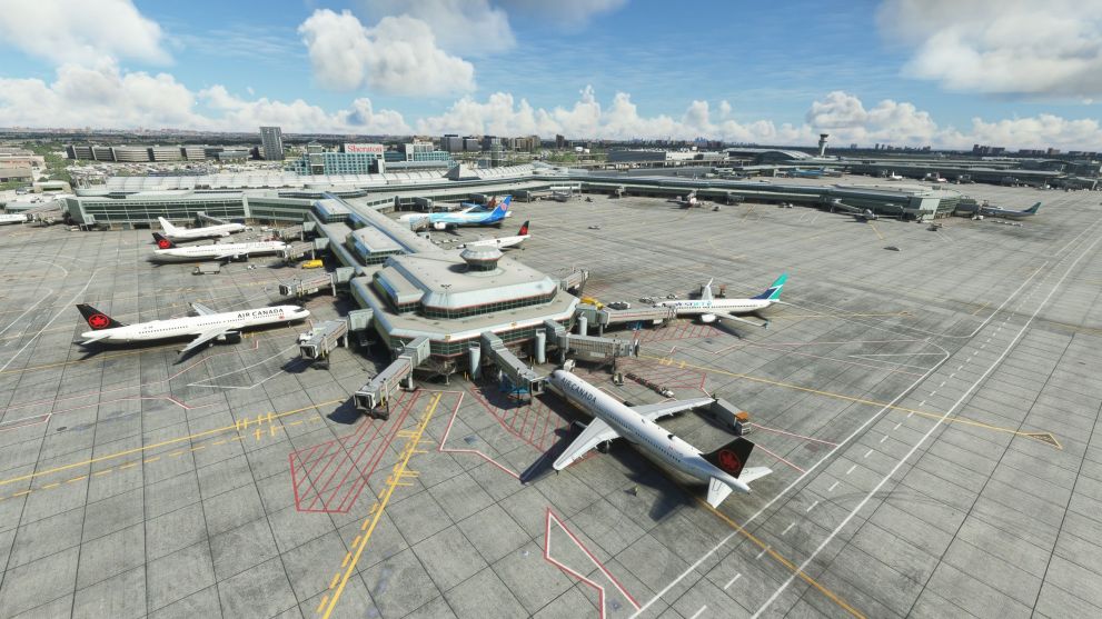
The many gates and ramps are correctly numbered, same as the taxiways, so you won’t have issues finding your way by following ATC instructions and the charts. Some of the lights also have their own custom models, which is always nice to see.
On the other hand, the color of the surface of the aprons is a bit too homogenous compared to all the photographic and video sources I could find, also missing some dark areas from recent repavings. This is disappointing considering that it doesn’t take research within obscure sources to find out, but simply following the airport’s official Twitter account is enough to see that something’s off here.
However, the work done on the terminal buildings is nothing short of masterful, with both 3D modeling and texturing that are absolutely industry-leading. This also extends to the interiors, which are modeled to a great extent, and absolutely spectacular to see from nearly every angle. This is fantastic considering that Toronto Pearson’s piers have a lot of glass in their architecture.
Speaking of glass, its tinting and weathering are also among the best in the industry, looking extremely realistic and blending well with the few windows that have been left opaque, mostly focused around higher levels.
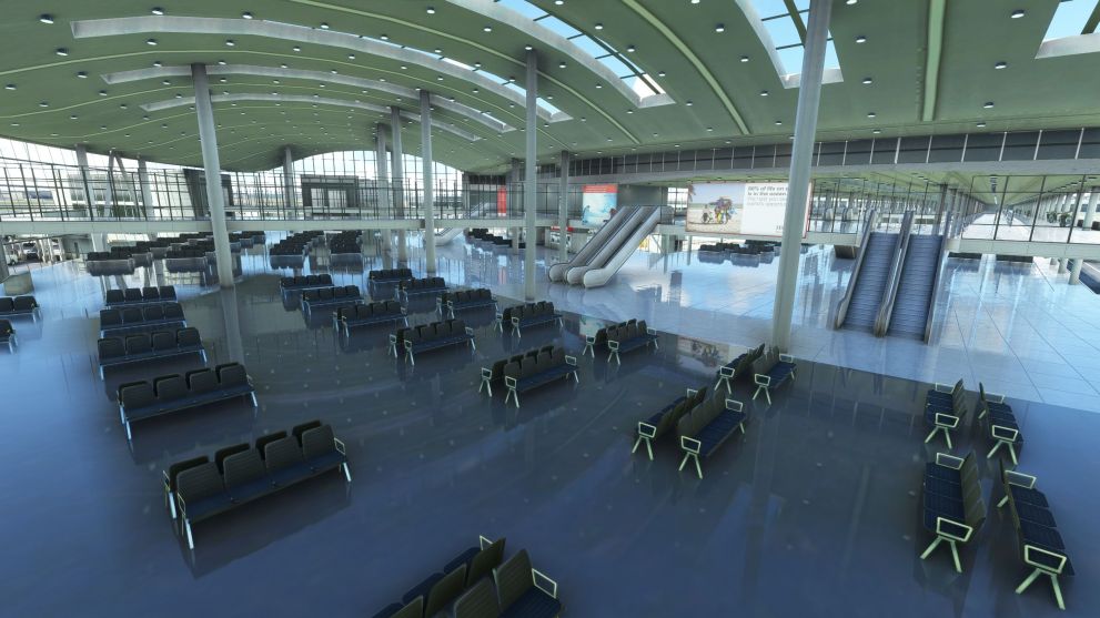
Both the airside and the landside areas are beautifully modeled and textured, with plenty of small details and signage. This is where FlyTampa really flexes its expertise, even more so due to the fact that the entire airport showcases an extremely solid use of physically-based rendering that combines wonderfully with weathering to depict surfaces that feel real.
The many hangars, offices, and warehouses around the aprons are also very accurate and realistic in their technical rendering, and custom models (albeit a little less detailed) extend to many hotels outside of the perimeter of the airport.
We even get animated shuttle trains traveling between the terminals, which is always a lovely touch that makes airports in Microsoft Flight Simulator feel more lively.
That being said, there are some pretty evident issues that we can’t omit. First of all, most of the jetways are simply incorrect. Only the newest glass jetways installed in 2019 at the easternmost pier of terminal 1 have a model that can be considered a good representation of the real ones.
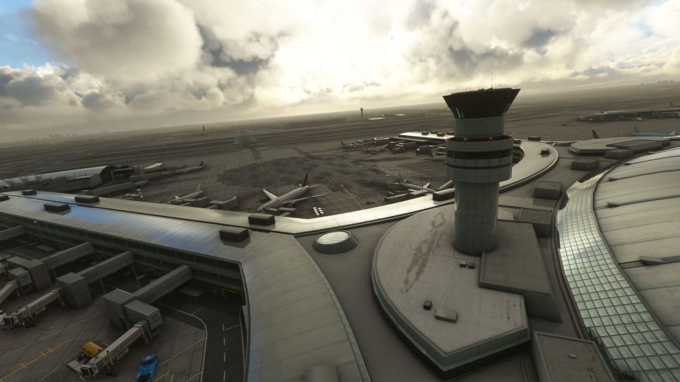
Unfortunately, the rest of the jet bridges of terminal 1 and those of terminal 3 are what I would call an approximate hybrid of the real ones. Those at terminal 1 are basically white in the real world and made with flat panels, while in FlyTampa’s rendition, the color isn’t too far off, but they’re made with corrugated panels.
On the other hand, the jet bridges of terminal 3 are correctly corrugated but miss on the color, which in the real world is a much darker blue-grey. on top of that, FlyTampa’s jet bridges for terminals 1 and 3 are identical, while they really aren’t in real life.
Further issues can be found in some of the buildings around the airport. During my research to establish the precision of the reproduction, I’ve found that multiple buildings (at least four, but there could be more) are severely out of date, having been demolished or fully renovated several years ago.
The most visible example is the new and massive Air Canada hangar that has been built, starting at the end of 2016 and completed in 2018, on the westernmost part of the main apron. Here we still have the old and much smaller hangar that was demolished six years ago.
This is a glaring issue considering that the new hangar is right on the apron, very visible during normal operations, and it’s absolutely massive (covering nearly 130,000 square feet and almost 80 feet tall). It’s not a small detail tucked away somewhere where you won’t notice it, and the one included by FlyTampa looks nothing like it.
This tells me that the airport has either been possibly rushed to market to “block” a competing one by a newer developer, or the proper research to fully update it while porting its models to Microsoft Flight Simulator from the version for an older simulator has been omitted.
Neither is an option that I consider flattering for a veteran and acclaimed developer like FlyTampa. I certainly hope that the outdated parts, the jetways, and possibly the aprons will be updated to fully reflect the current state of the airport.
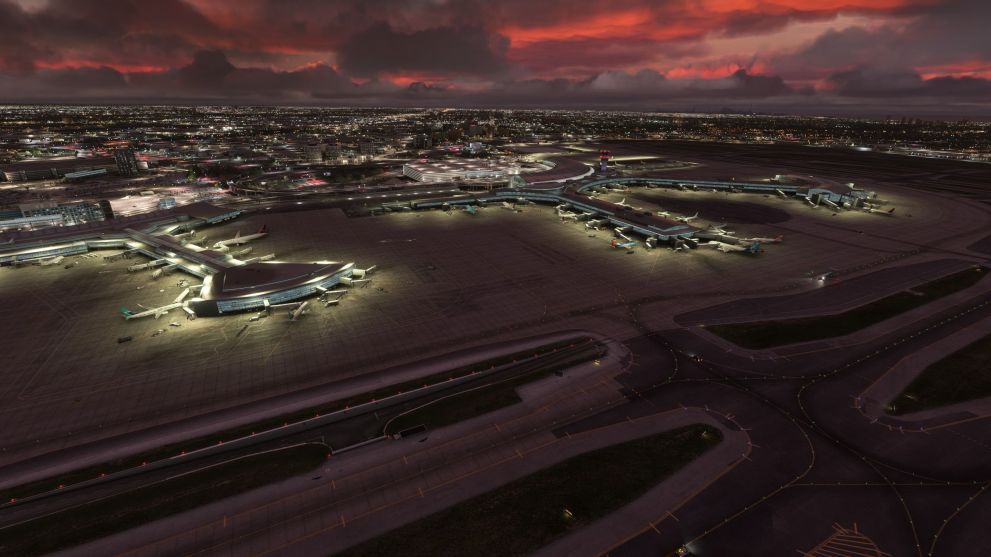
Moving back to positive elements, the lighting is spectacular, including the aprons, taxiways, and runways. The transparent windows, which are so often problematic in many airports at night, also look great. Toronto Pearson looks as beautiful after hours as it does during the day.
The modeling and texturing also react very well with the weather. You could say it looks even better when it rains. Snow coverage is adequate, and while there still are a few rough patches and weird transitions between taxiways and runways, it’s difficult to gauge how much of that is due to the limitations of the platform, but it’s still a ton better than the vast majority of third-party airports.


Performance is one of the most (positively) surprising aspects of this airport as FlyTampa has accomplished what I would define as an optimization miracle. This kind of massive and highly-detailed hub tends to hit hardware hard in Microsoft Flight Simulator, but in this case, it really doesn’t.
As you can see above, I lose less than 10 FPS comparing the default scenery (above) and FlyTampa’s rendition (below) on my PC (RTX 3070, Ryzen 9 3900x, 32 GB RAM) at 1440p resolution and ultra detail settings, despite the enormous difference in detail. Video RAM usage is also kept very much under control, which is remarkable.
Ultimately, FlyTampa’s Toronto Pearson shows, once more, the technical prowess of the acclaimed developer with a rendition that looks absolutely stellar. Few airports for Microsoft Flight Simulator look as beautiful and feel as realistic in terms of pure visual craft.
That being said, the outdated parts and the approximated jetways do drop the overall quality a visible step lower than perfection. It’s still very much a purchase that I’d happily recommend if Toronto is among the destinations you fancy, but an update fixing these issues is required to truly do justice to both the airport and FlyTampa’s own reputation.
Pros
Cons
Multiple buildings are outdated by several years.
Some of the runways and the of the apron areas could use having their colors tweaked.
PAPI lights and windocks are set up incorrectly.
