The UI Is Pretty Atrocious
Takeaways From the Metal Gear Survive Beta
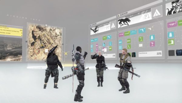
Before going out on a mission, Metal Gear Survive puts players in a mission prep area where you get to organize your equipment before setting off. It all looks very clean and clinical, but the user interface is a complete mess. It’s a minor complaint, but forcing players to run over to a circular area to do simple things like checking the mission list or leveling up is annoying and unnecessary. To go on a mission, you’d have to enter a circle, press and hold a button, then choose a mission from the list. After that, you’ll then have to go to another circle to start the mission proper. It’s tedious, and the whole thing could be more streamlined.
Even sorting through your items and equipment is a mess; it’s not entirely clear which categories your weapons fall under. For instance, an assault rifle can be equipped to replace my axe, but for whatever reason, it can’t be equipped in any of my gun slots. As mentioned previously, using items requires way too many button presses. But when you want to throw a molotov cocktail or grenade, your character does it immediately after you release the bumper button, even though there’s a button prompt onscreen to let you know you can throw it under or overhand. It feels inconsistent with the way you use other items and that, too, is annoying.