Their Dashboard is Still a Mess
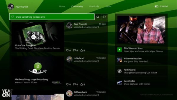
As someone who’s spent a lot of time on Xbox One, it’s still amazing how none of the issues with their dashboard have been addressed. While Microsoft has always been a company that’s attempted to streamline everything, the archaic and chaotic design for the dashboard’s different pages still presents a problem. Given during their E3 press conference they remarked on adding new and exciting features like communities to their system, one would hope this meant a major dashboard overhaul.
Nope, here we are months later with page layouts that look awful and feel as if Microsoft just slapped together a bunch of square based photos and icons and called it a day. Navigating the online store feels like a chore at times and it doesn’t help that the menu system itself is unresponsive at times. While the Xbox 360 menu wasn’t perfect, it was still quite easy to navigate and use. It’s been 3 years since the consoles release and still, somehow, Microsoft has yet to fix it.